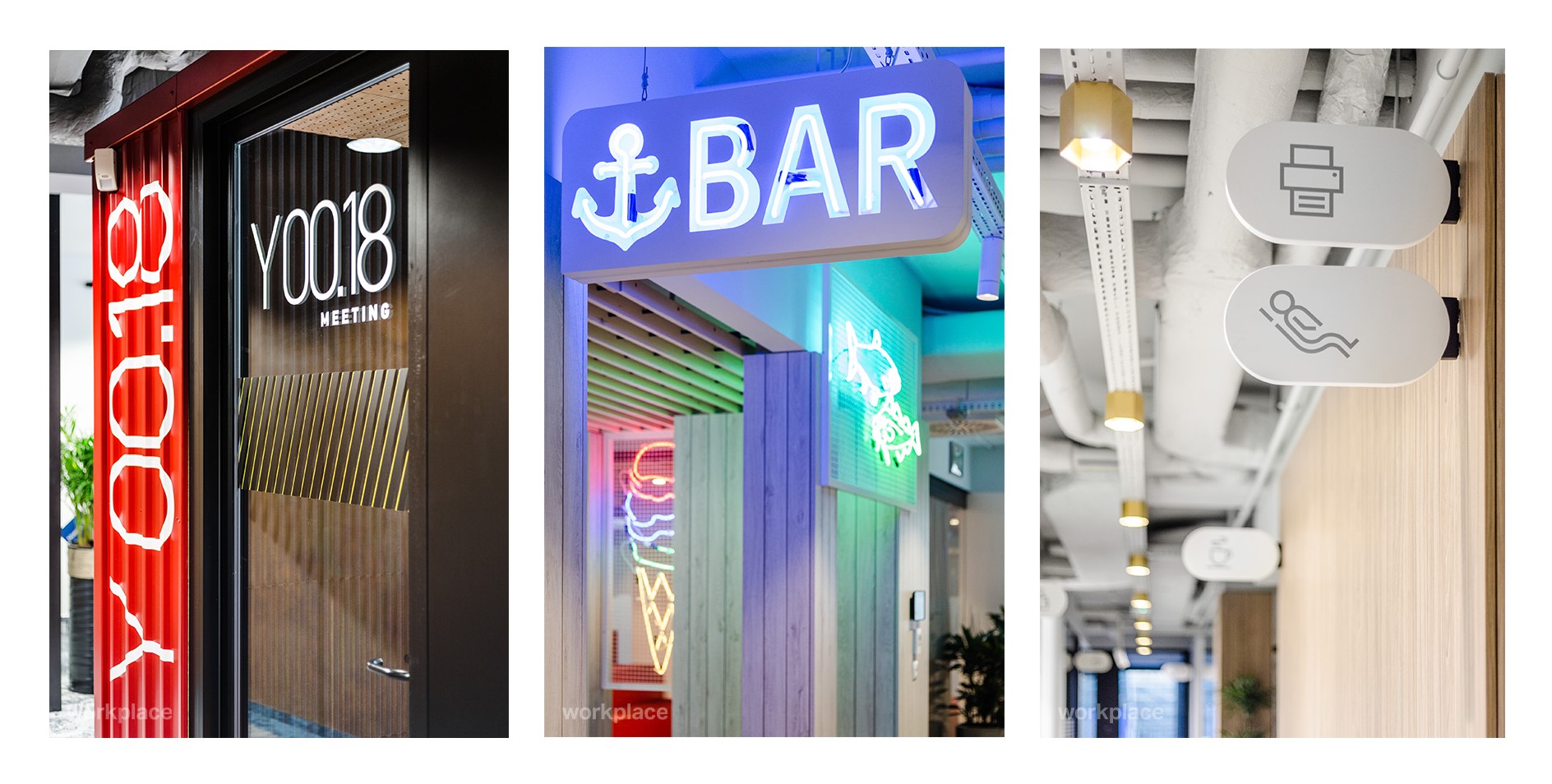
Wayfinding & space branding | Visual guide in the office
What helps us with spatial orientation? How to design user experience and emphasize corporate values in the work environment? The answer is wayfinding and space branding, which are integral parts of the office arrangement. Drawing from our design experience, we present these subjects and explain their value for people and business.
Wayfinding. How to ensure good communication in the office?
Let’s imagine we are in a hurry for a plane. We are late and run into the airport hall instinctively looking for any signs, signboards or notices which indicate the right gate. Even though the space is familiar, it is hard for us to distinguish particular spots without the right marking. In the work space, the situation looks quite similar.
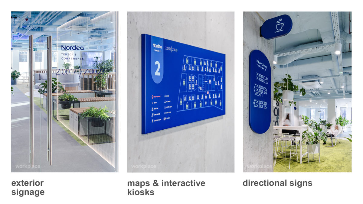
Wayfinding navigates you through an office, railway station, museum or airport. It is a system of spatial orientation helping people determine their location and showing the right way. Identification and organisation of a particular spot – a building or city – is made easier with the use of architectural and graphical landmarks.
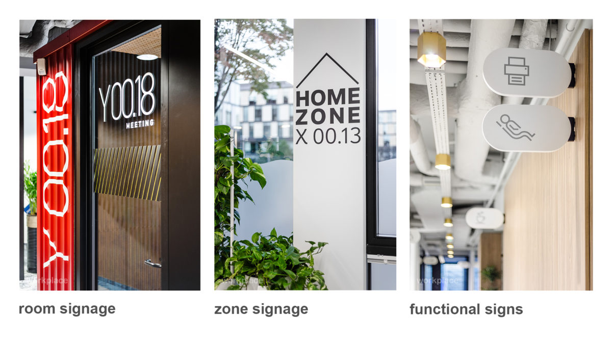
This is an intuitive answer to the following questions: Where am I? Which way did I get here? Am I close to my destination? Although the system does not absorb our attention directly, it explains in a clear and transparent way how to find a particular spot and makes it stand apart from other similar sites.
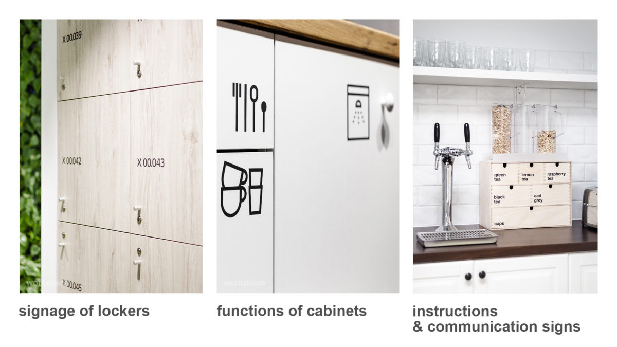
Wayfinding improves everyday experiences of the work environment. Furthermore, it enhances communication amongst employees and introduces integral terminology of space – meeting rooms, team zones or shared spaces. Besides the communicative aspects, wayfinding also proves crucial for administration. The marking and numbering of desks, chairs or cabinets is a basic tool for fixed assets management in a company.
Space branding. Should the office space be an extension of a company’s visual language?
Let’s imagine an office. Walls painted in dull colours, simple design, few details. There are no unnecessary accessories, however the space is marked properly and clearly. Even though the premises serve their purpose, the place is anonymous, unfriendly and monotonous so people do not like spending time there. How come? How to solve this problem?
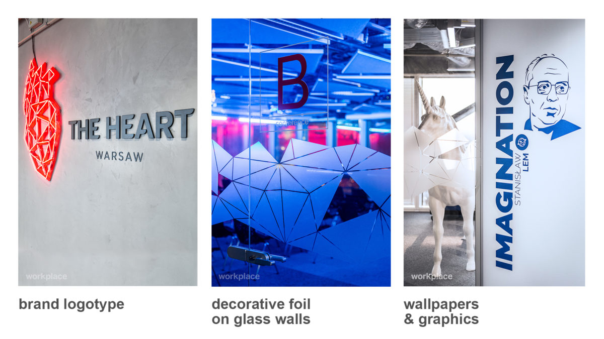
Architectural and graphical details tell us the story of a place and emphasise or create its personality. In work space design we define them as space branding. This is a graphical enhancement of an architectural design and a chance to show a company’s culture and history through a visual presentation of it. It is implemented to present the key corporate values by means of simple graphical components.
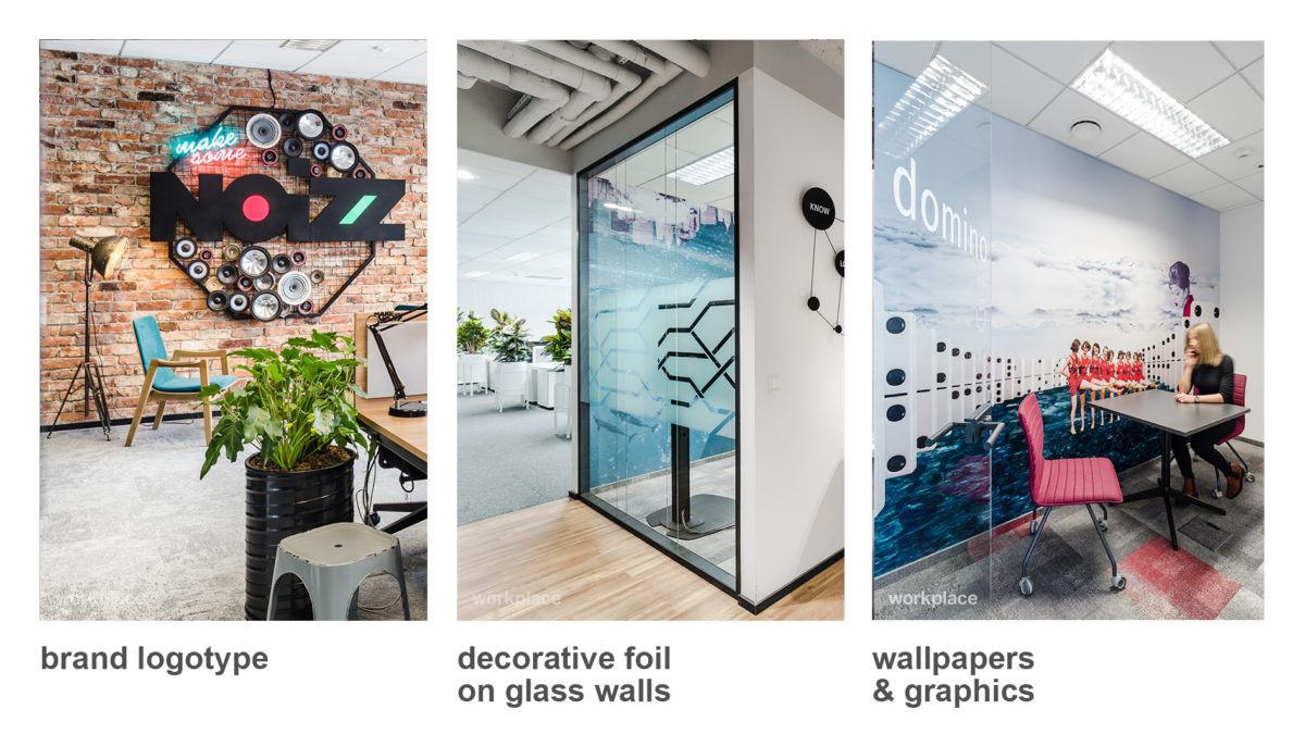
However, space branding is not a company’s advertisement on the walls! The colours, shapes and forms used should be just a slight association with a logotype and reference to a corporate brand book. Visual identification of a work space is addressed to the employee – so it cannot be a marketing tool. Space branding is a part of the employer branding strategy, and its aim is to optimise positive experiences in a workplace, contribute to the well-being of an employee and stimulate the user’s imagination.
What is the main value of space branding? In the employee era the image of an office could be the key factor in a fight for the best experts. Spaces with integral graphic identification create an emotional bond between a user and the space. Such offices attract people and encourage them to work.
How to implement wayfinding and space branding in a work space?
These systems are crucial parts of a well-designed office which should be intertwined and integrated as regards their aesthetics and content. However, they do not need to appear next to one another. The experience of our office designs helped us to devise three different techniques of wayfinding and space branding implementation, depending on the needs of the work space.
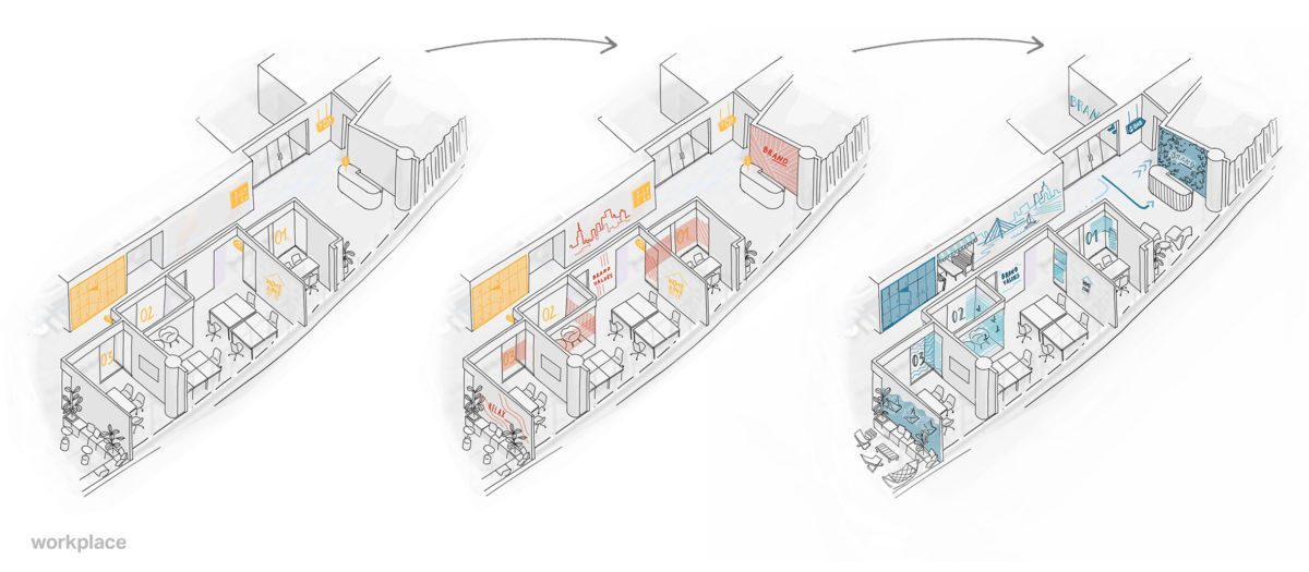
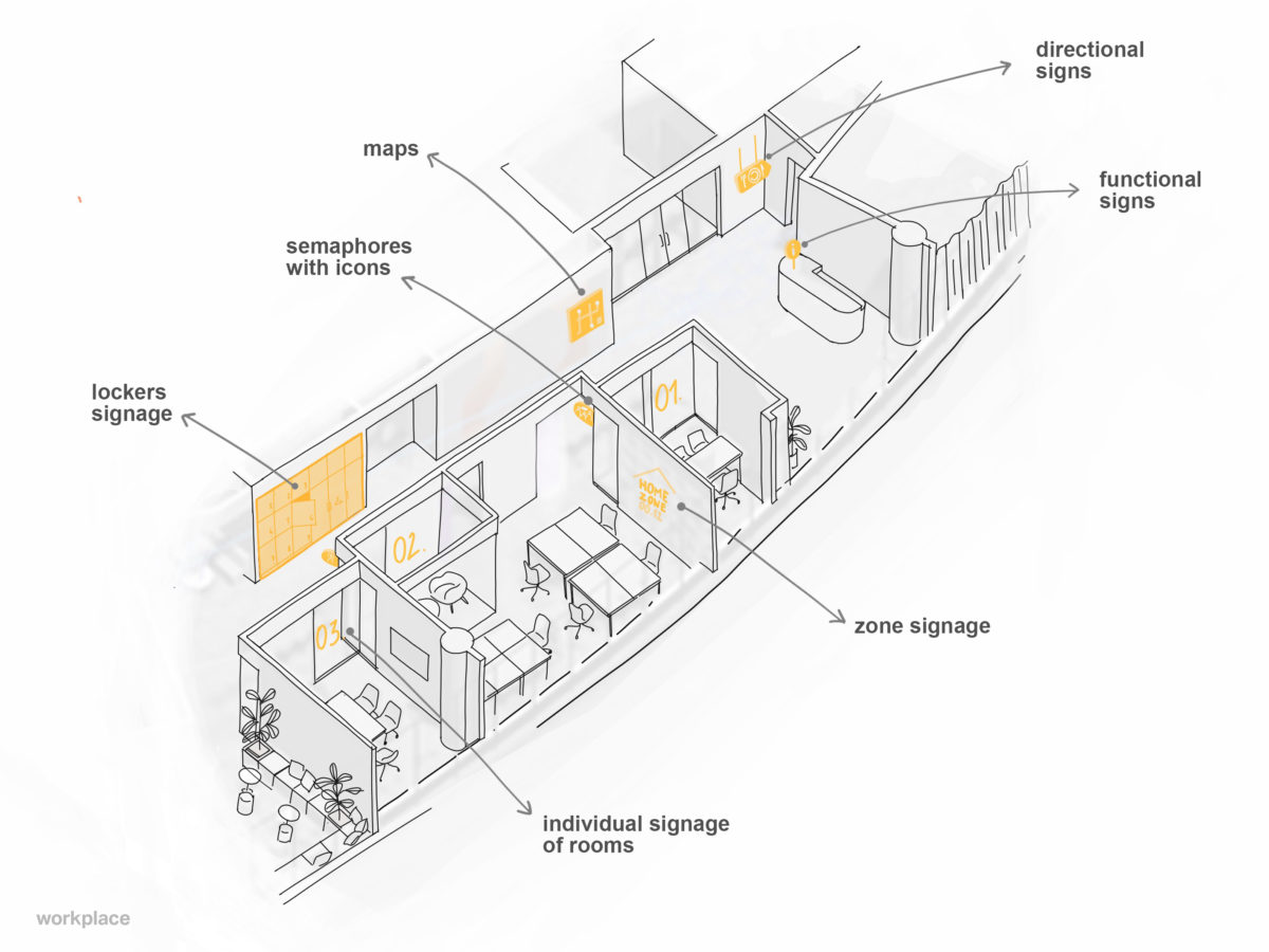
1. Basic wayfinding.
In order to improve communication and everyday work a basic system of spatial orientation is needed. It is the best solution for small offices or companies with a limited budget. Simple maps, direction signs, marking of rooms, pictograms and an integral system of communication make the work environment more user-friendly and stimulate employees to communicate more effectively.
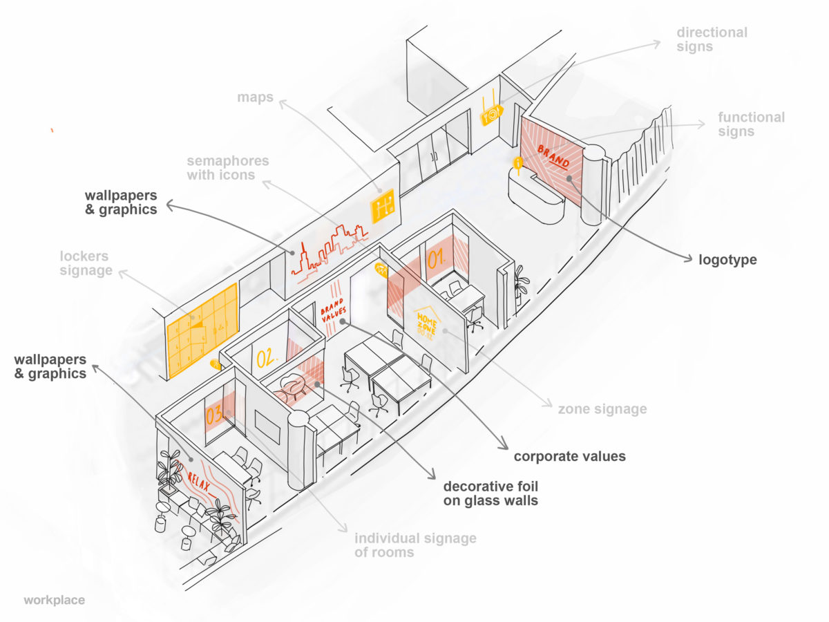
2. Wayfinding and basic space branding.
Besides ergonomics, optimisation of user experience in a work space and emphasis on corporate values should also be taken into account. Simple graphical elements, referring to a business profile or corporate colours, are all you need to add a personal touch to the interior and liven it up. A logotype at the reception desk, glass parts covered with decorative foil or graphics and wallpaper on the walls make the office more friendly.
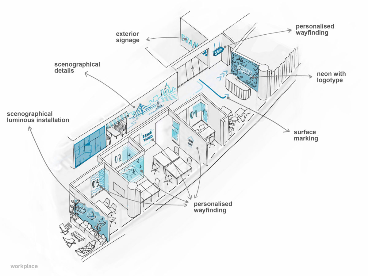
3. Personalised wayfinding and space branding.
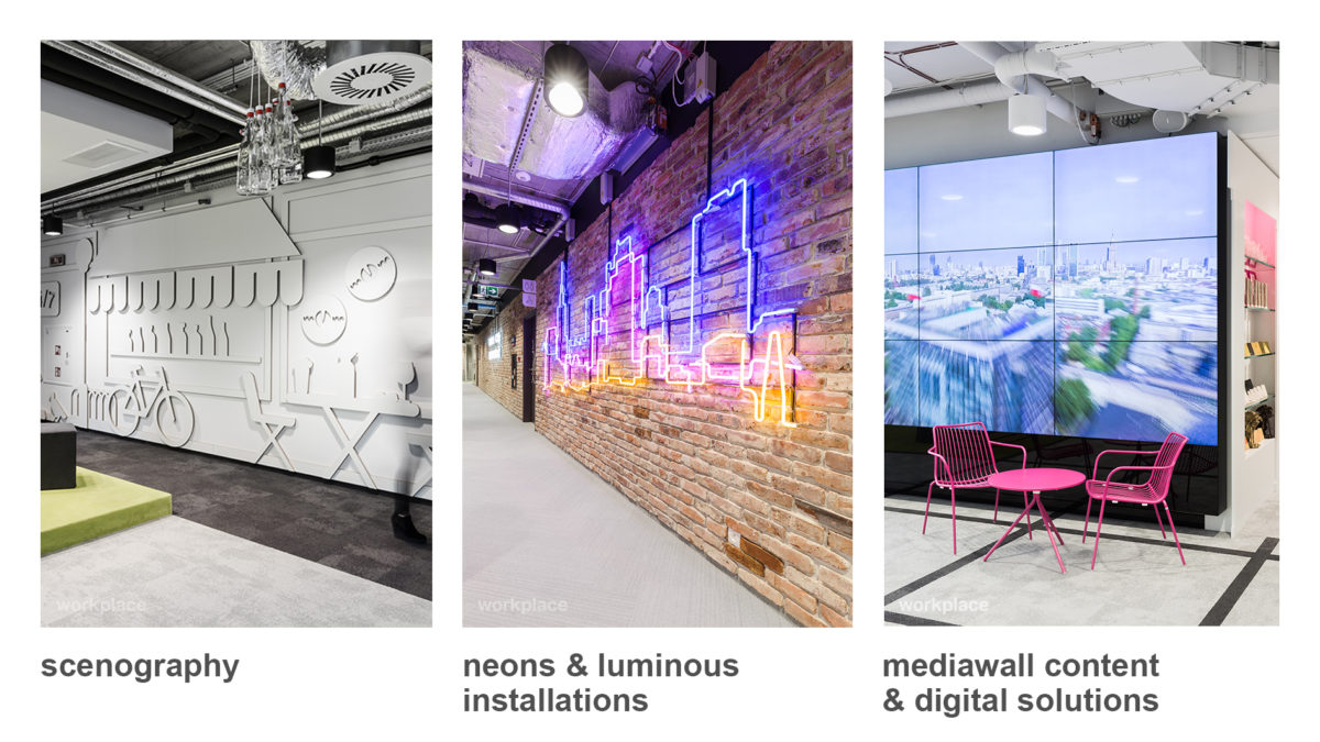
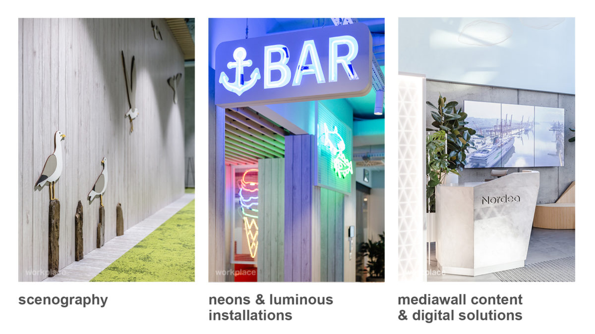
A concept of the office interior is usually designed around a unique leitmotif. This pattern is a starting point for the idea of a design and history that is being developed. On this occasion, the whole architectural concept should be viewed in a holistic way and that it why a personalised and graphically coherent project of wayfinding and space branding should be an integral part of the concept. A good idea is to diversify the system of marking and graphics with visually stimulating neon and luminous installations and set design elements referring to the main inspiration. It makes the office not only a well-designed area but also a place with an identity, evoking emotions and catering to the emotional needs of its users.
Story: Mateusz Sikora
Graphics: Urszula Kuc, Mateusz Sikora


