Modern Elegance | Savills
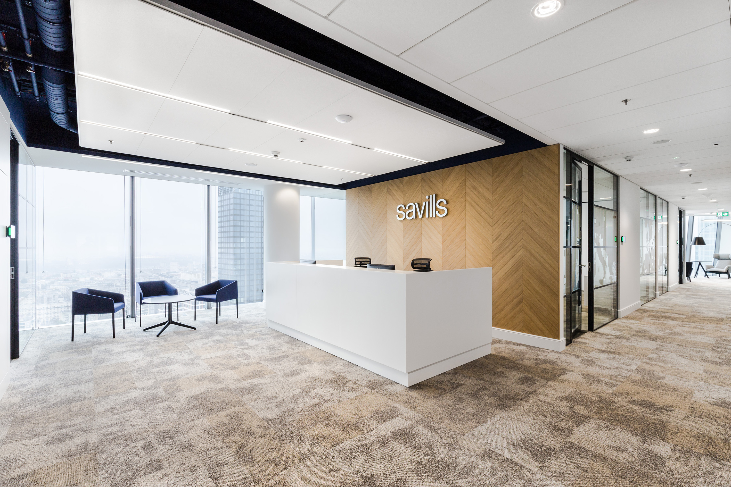
The head office of the company Savills in Q22 building in Warsaw combines British elegance with minimalist Scandinavian design. Even though the office is one of the smaller projects completed by Workplace in 2017, the development of the concept was surprisingly time-consuming.
The first stage of the project consisted in a pilot study that allowed employees to test different work models. A mock-up of a new kind of experimental workspace had already been created in the previous office. The experience with working in different usage zones (including a project zone, ad-hoc zone, quiet focus work zone, activity based work zone, or temporary work zone), provided an opportunity to investigate the actual employee needs and preferences. The feedback on the experience was summarized in a survey and became one of the key elements that underlay the design of the new office. For the next 5 months, we cooperated with the client to develop a number of design concepts, and then select appropriate finishing materials to finally create a unique workplace.
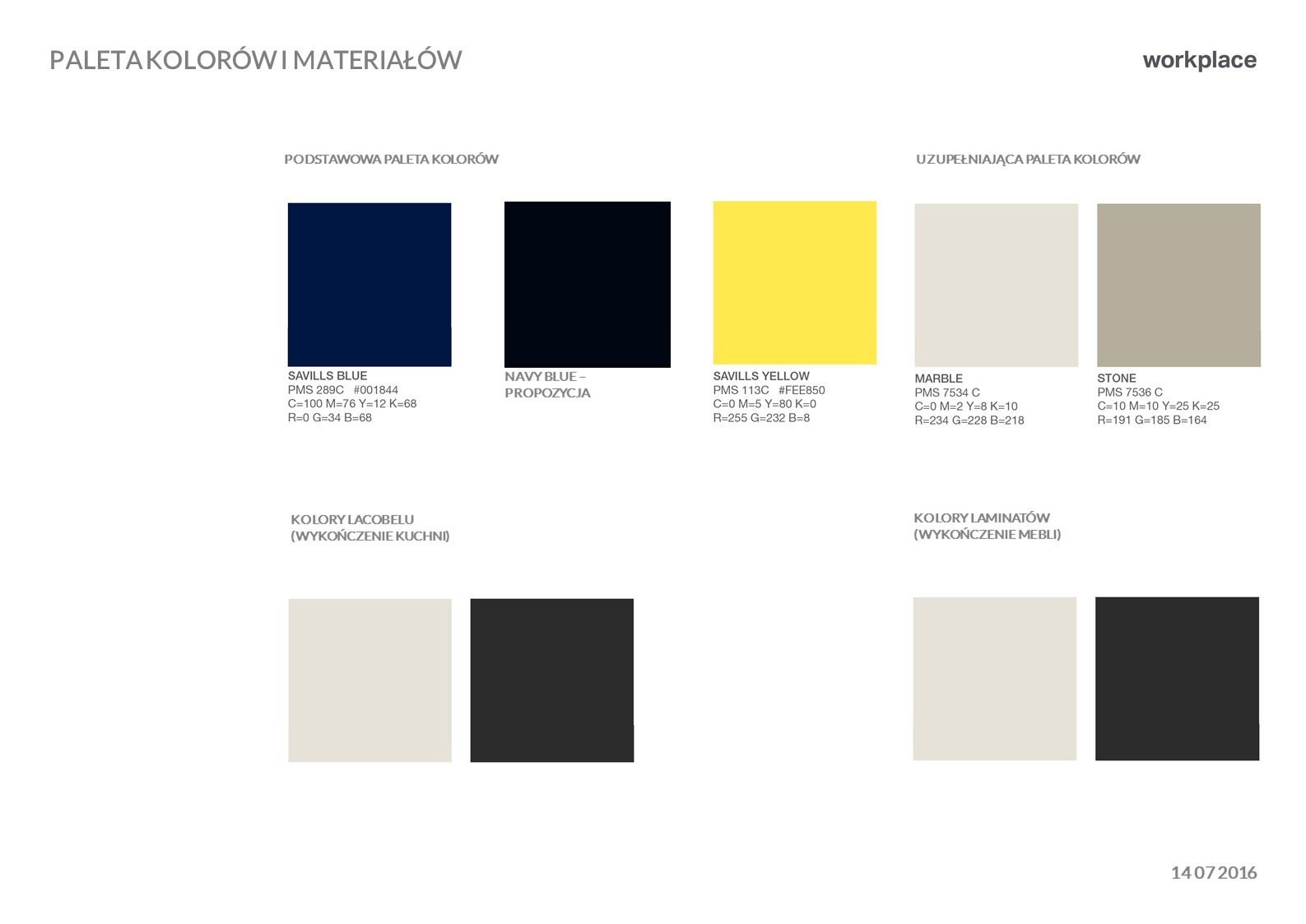
The design process started with workshops which focused on setting project priorities and determining the stylistic direction. The principal consideration was that the design should make reference to company values, including commitment to top quality service, responsibility, ethical conduct, respect, focus on development, prestige, and professionalism. It was also important to showcase the company’s recognizable logotype and color scheme including navy blue, yellow, red, and grey hues.
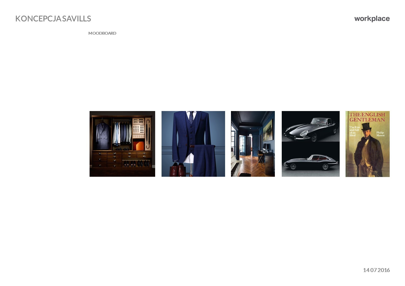
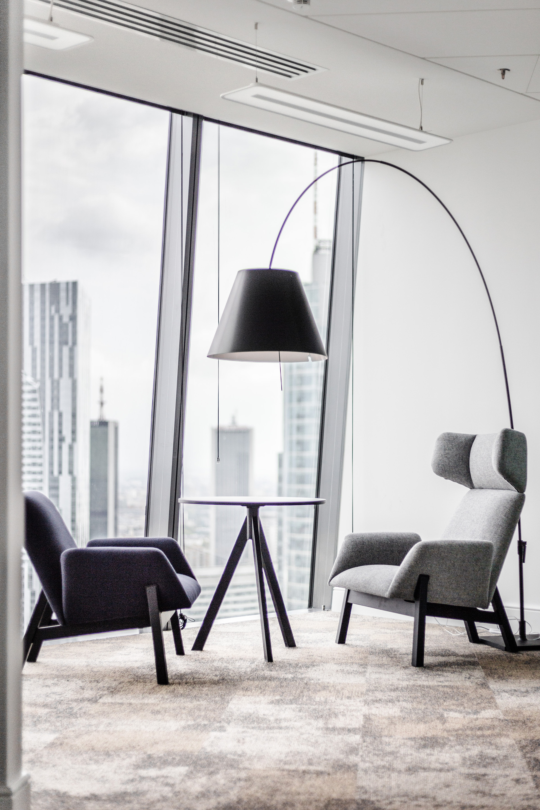
The basic considerations were translated into a visual language, allowing us to design an elegant office space while using elements made of wood and an array of grey hues to create a warm and cosy feeling. The design is complemented with details which evoke associations with a British gentleman’s study, including tall skirting, floor lamps, thick woven curtains, mirrors, glazing with fine regular grilles, gold-colored accents (space branding), a combination of different textures and precious materials, and stylized yet simple and minimalist furniture. Works of art (paintings made available by Zachęta Gallery as part of its cooperation with Savills) displayed gallery-style add a finishing touch to the interior.
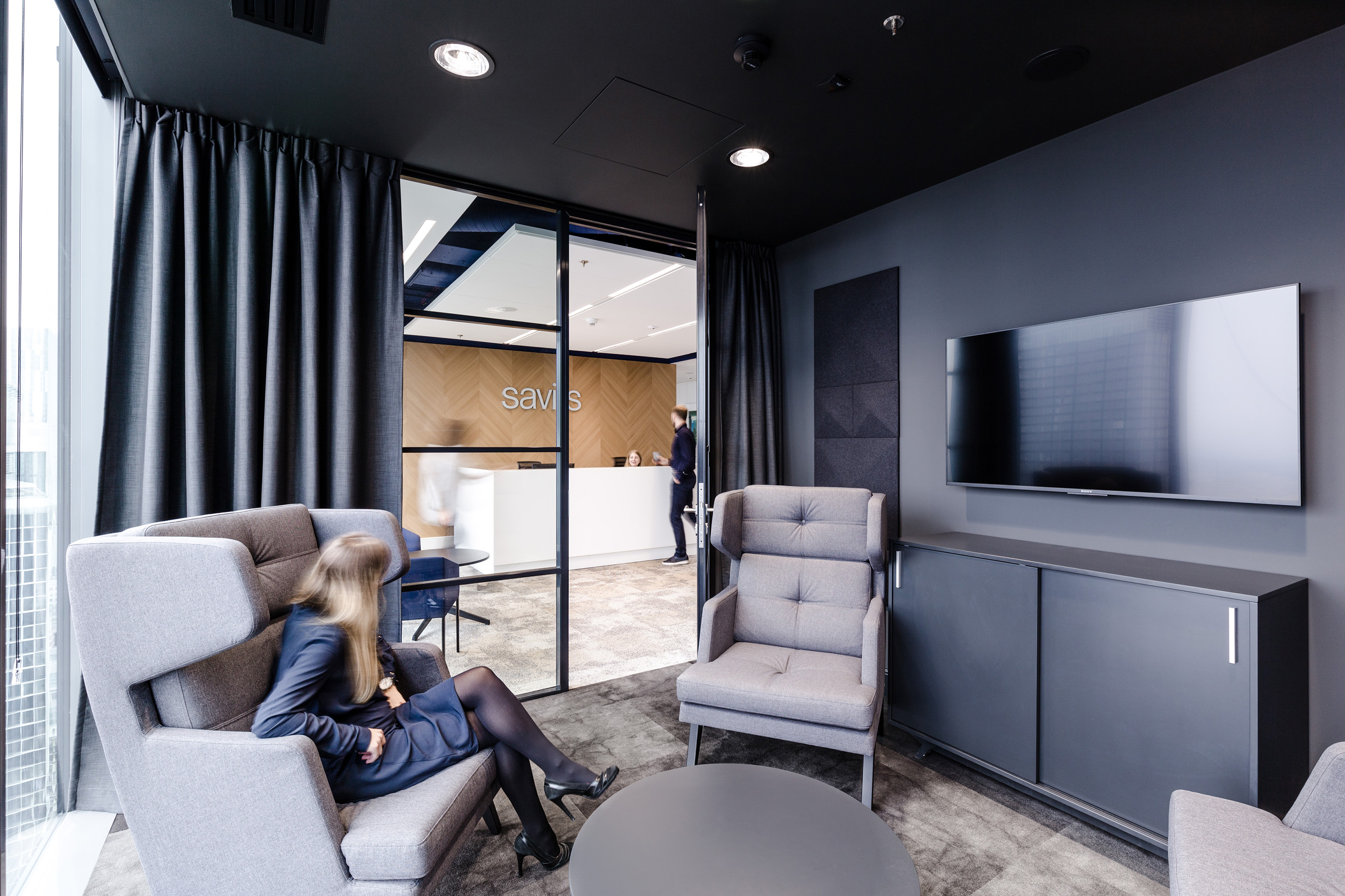
For functional purposes, a clear-cut division into two zones: the client zone and the employee zone was adopted. The former is a representative zone comprising an elegant reception area which affords a beautiful view of the Warsaw skyline and different sized meeting rooms accessible from the corridor with the works of art. The reception area is in and of itself one of the most fascinating parts of the design. We created a total of about 30 different concepts of the reception area, ranging from crazy, colorful and modern to subdued, formal and stylish. The reception area adjoins the black room, i.e. a small room similar to a cigar lounge which is intended as a monochrome “gentlemen’s corner” all in dark grey and black.
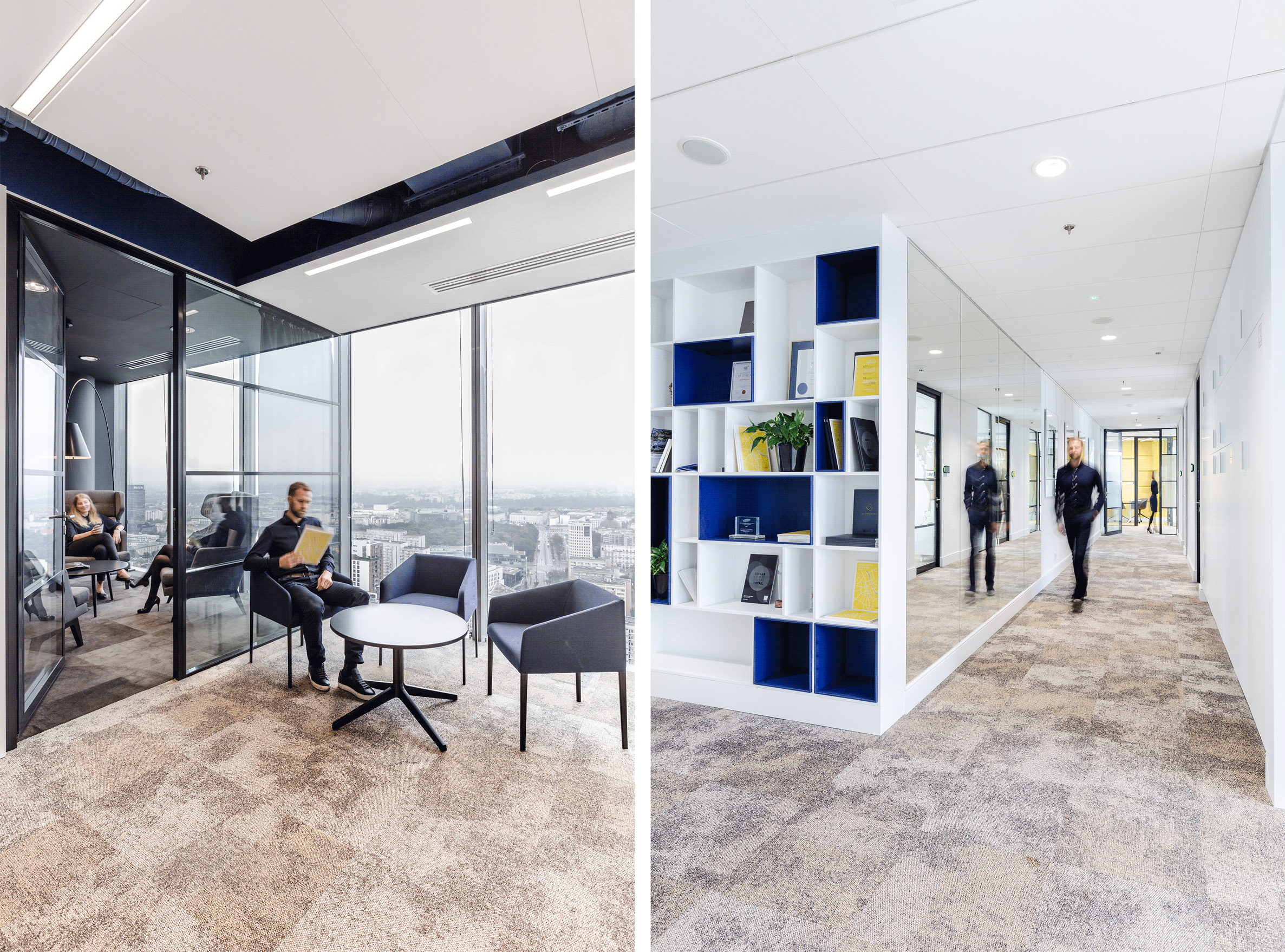
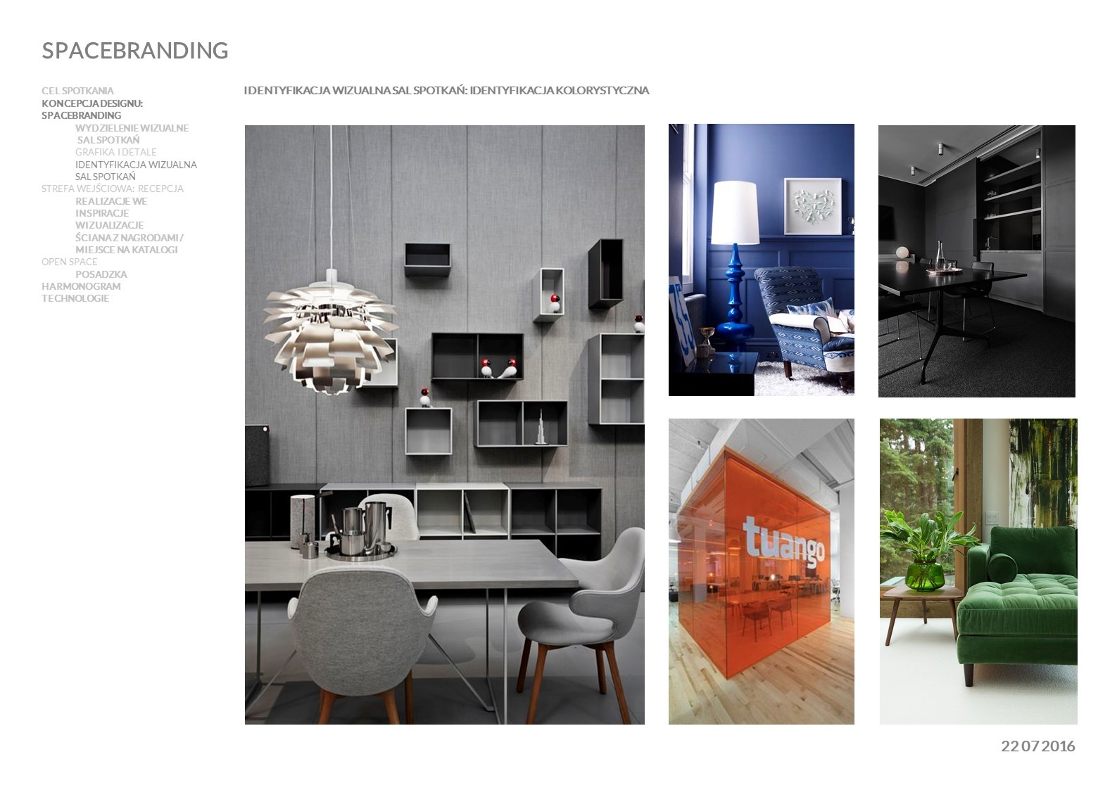
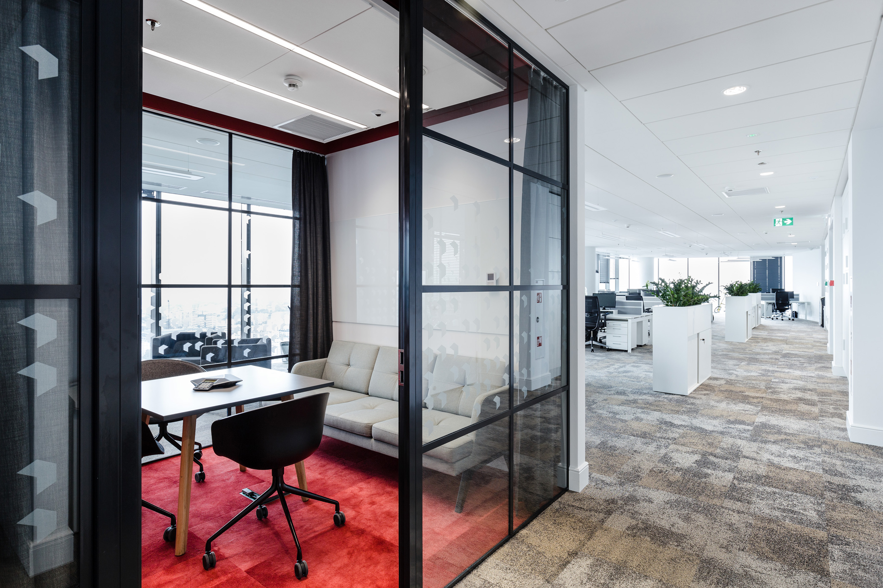
The employee zone also has a subdued look, but it is less formal at the same time. It is more colorful, with indoor plants and framed drawings. The meeting rooms reflect the Savills color scheme – each of them has one of the company’s colors (red, yellow, navy blue, or grey) as its dominant theme introducing a vivid accent to the subdued work environment and providing easy visual identification. Within the zone, employees have been located according to their needs: for privacy, collaboration, or easy access to additional functions, while also considering the forecast development of the teams.
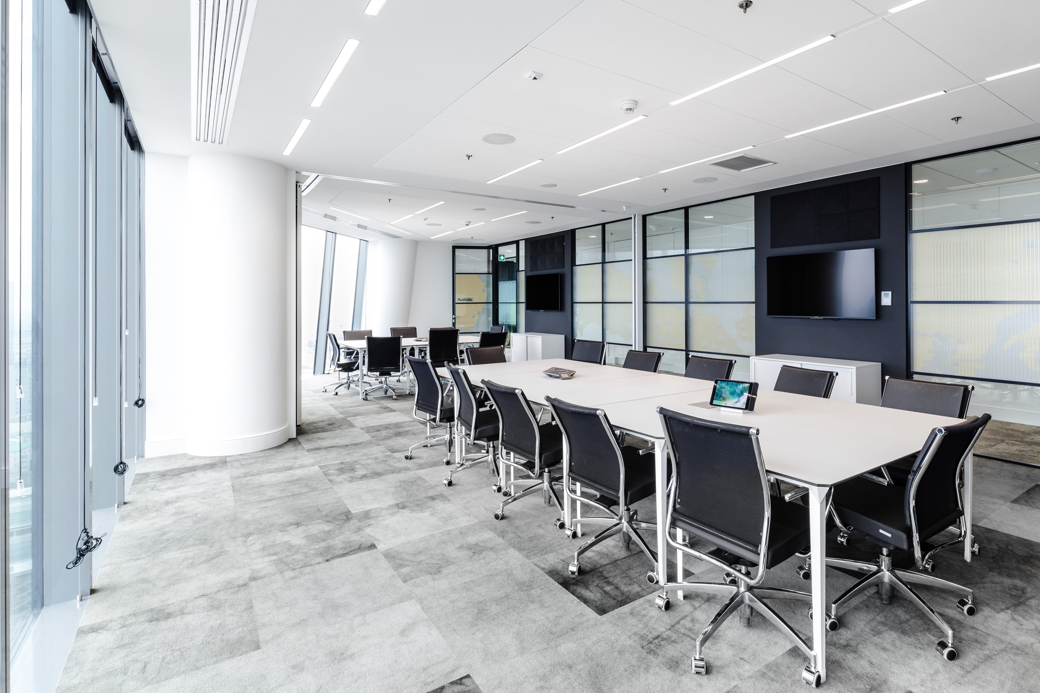
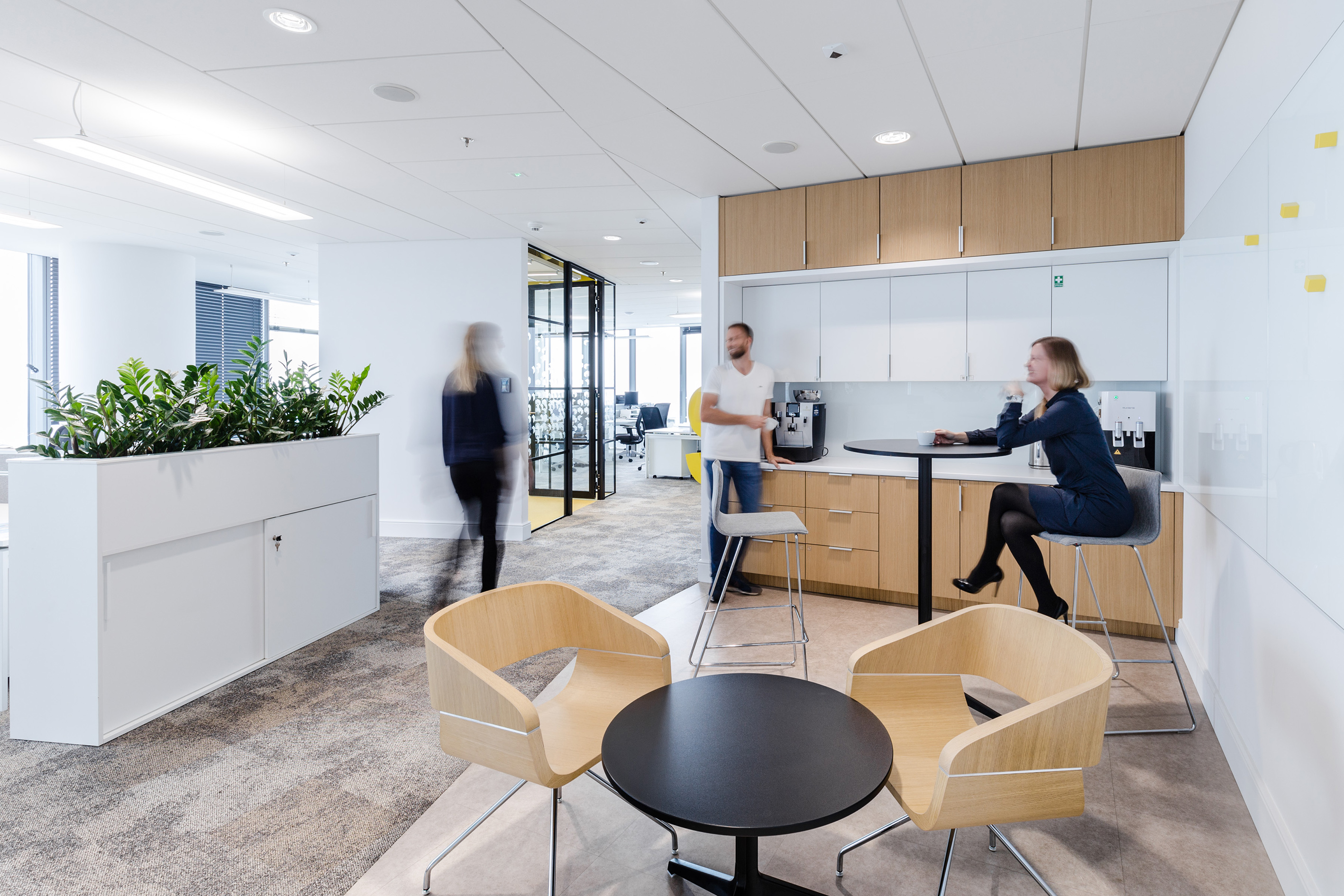
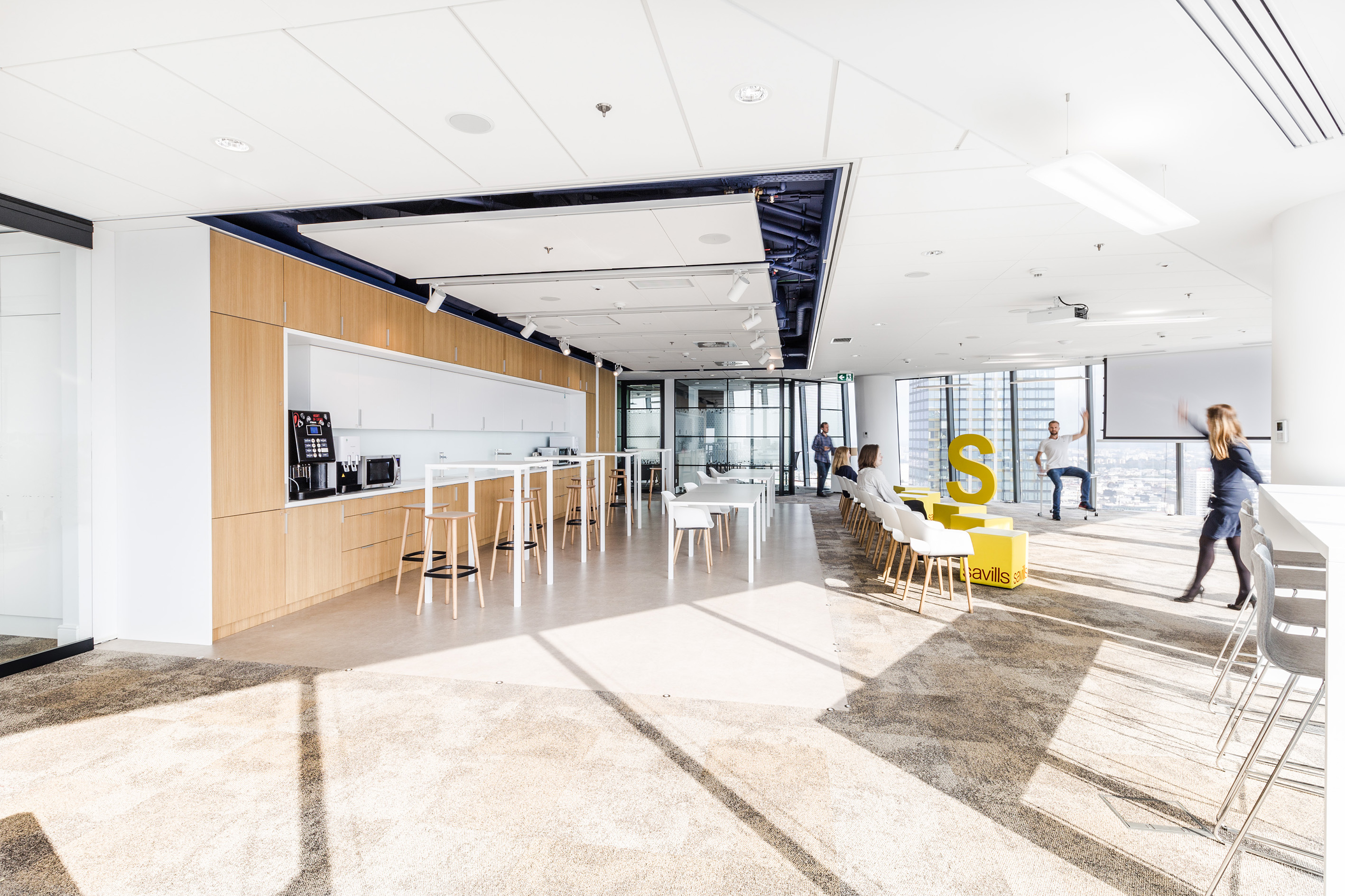
The main communal area has been designed with flexibility in mind. Whenever a need arises to hold a town hall meeting or a big event, thanks to movable glass partitions, a corner of the open space can be easily joined with the area which normally serves as a kitchen. The space is easy not only to modify, but also to set apart from the rest of the office, if necessary. The zone has been equipped with an AV system and an in-ceiling roll-down projector for slideshow presentations, lectures or informal gatherings of all employees.
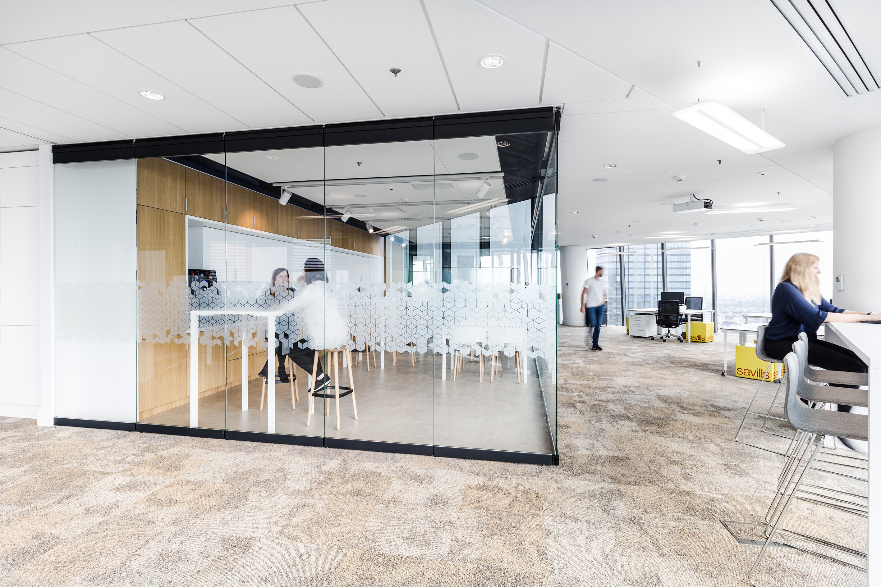
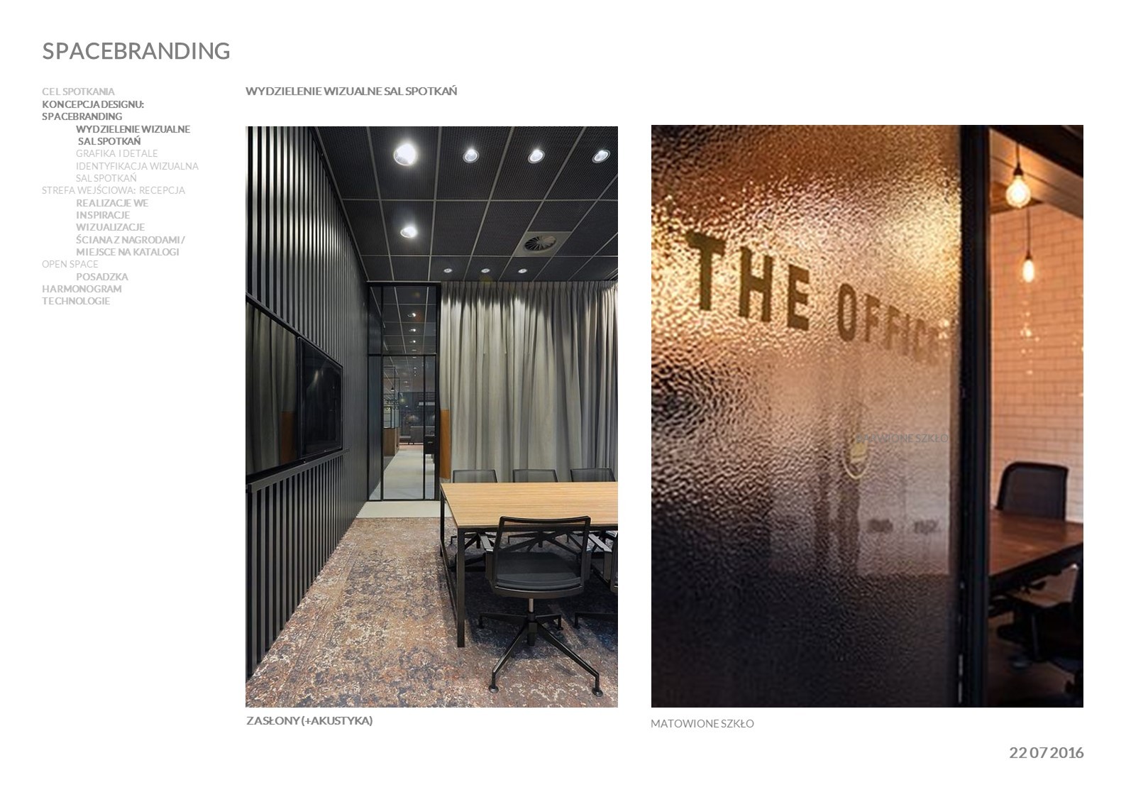
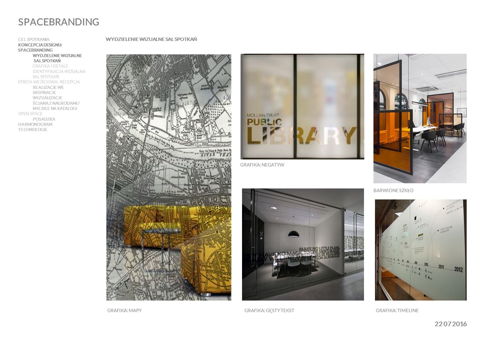
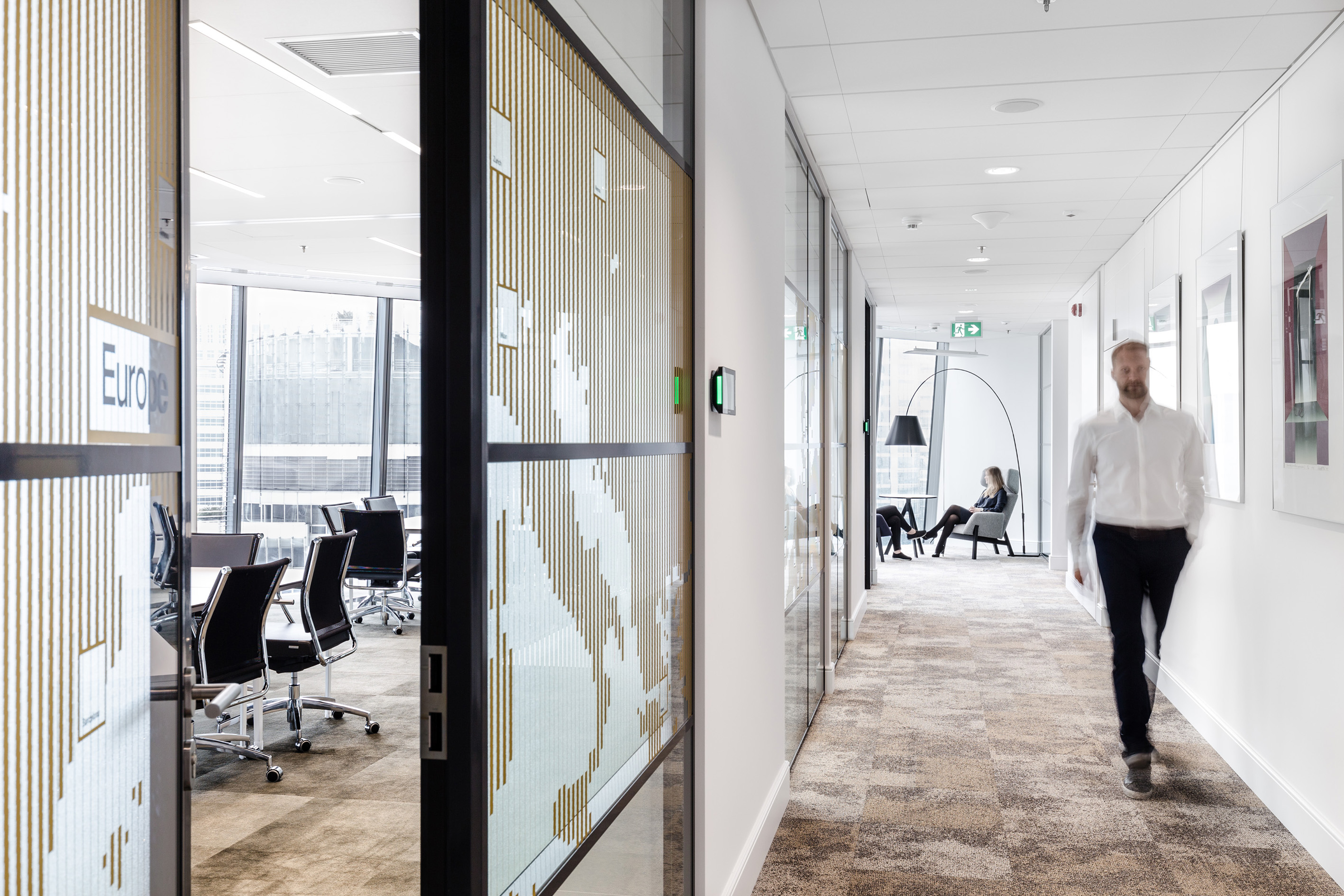
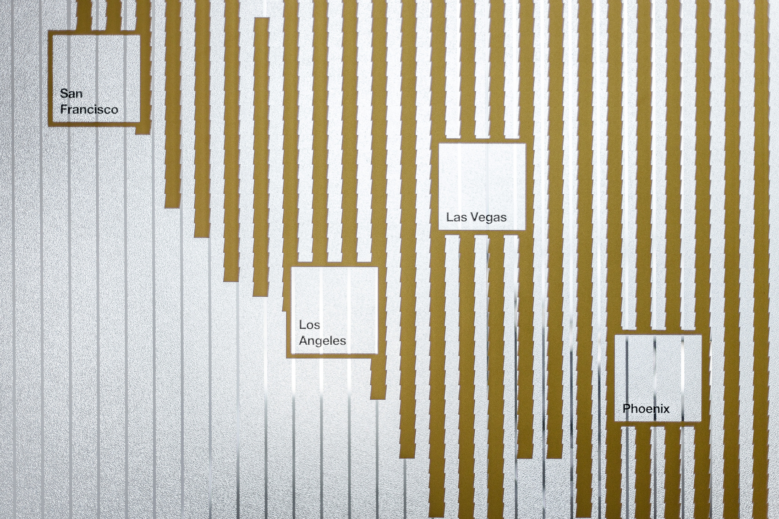
The design has been rounded off with dedicated way-finding and branding solutions. In order to select the right decorative glass films for the client zone, we prepared a number of mock-up solutions based on the existing conference room glazing. The structural and gold-colored films were chosen and applied to both glass panes (double glazing) to achieve a unique 3D effect.
The Savills office interior design project was completed within the budget for interior finishing assigned by the developer.
Principal design guidelines:
- A clear-cut office division into a representative zone for clients and an informal zone for employees.
- A flexible communal area for socializing and networking, which can be adapted to host a town hall meeting or an informal staff gathering.
- A layout of teams and workstations flexible enough to accommodate future growth of the company.
Savills Office in numbers:
- Scope of services: brief, strategy, pilot project, concept design, executive design
- Area: 1080 sqm
- Number of workspaces: 107
- Number of floors: 1
- Location: Q22 in Warsaw, Jana Pawla avenue 22
- Duration: 9 months
- Work character: diversified, from administrative functions to creative work
58% of surface dedicated to individual work (desks)
42% of support surface (meetings, social, other)
28% of client zone
72% of work zone
Project team:
Bogusz Parzyszek, CEO | Founder
Dominika Zielińska, Head of Architecture | Managing Partner
Ewa Jędras, Senior Architect
Daniel Dziczek, Architect
Damian Bieniek, Anna Rzeźnik, Kasper Skirgajłło-Krajewski, space branding & wayfinding
Adam Grzesik, photo


