Generali | Modern design with a touch of the Renaissance
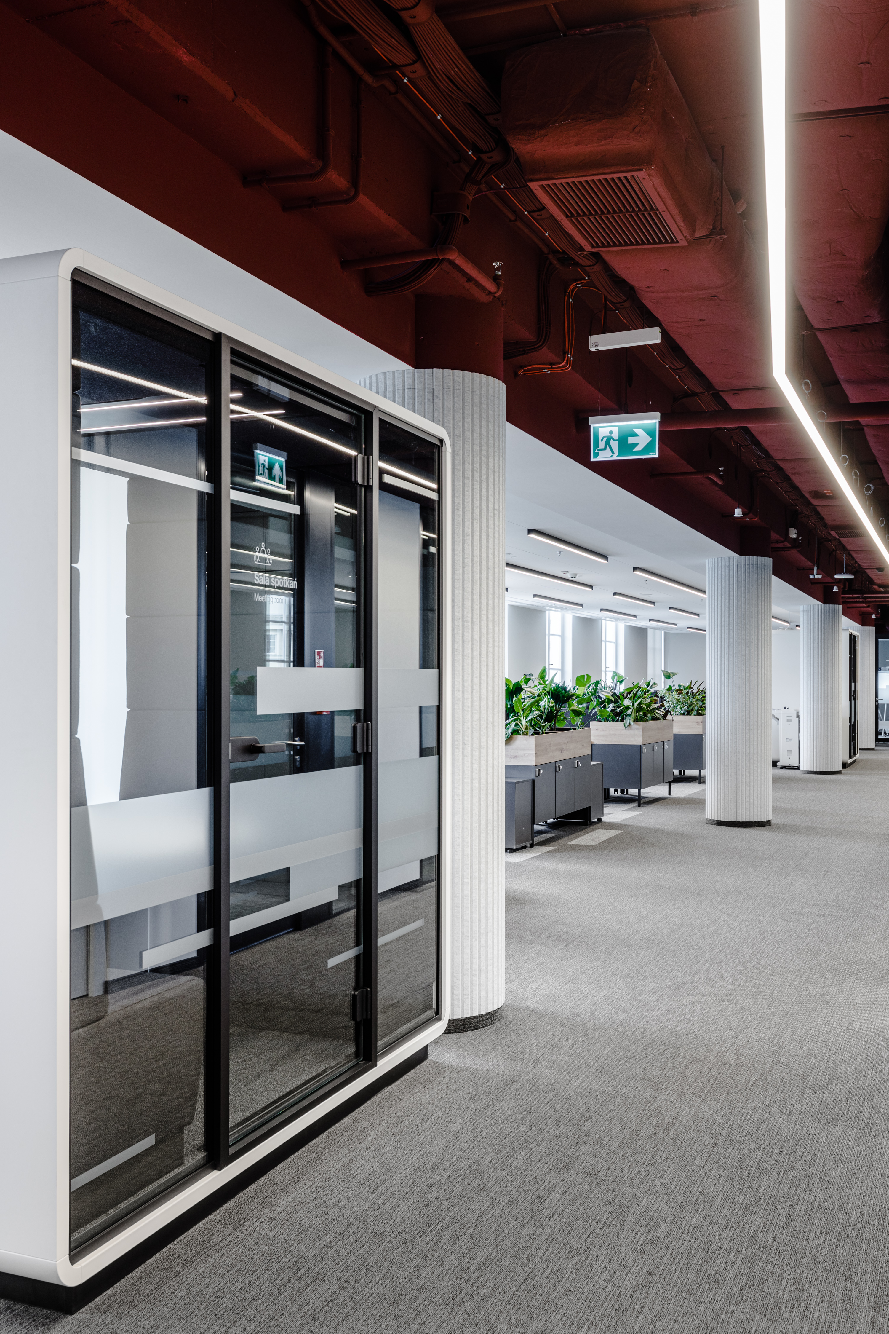
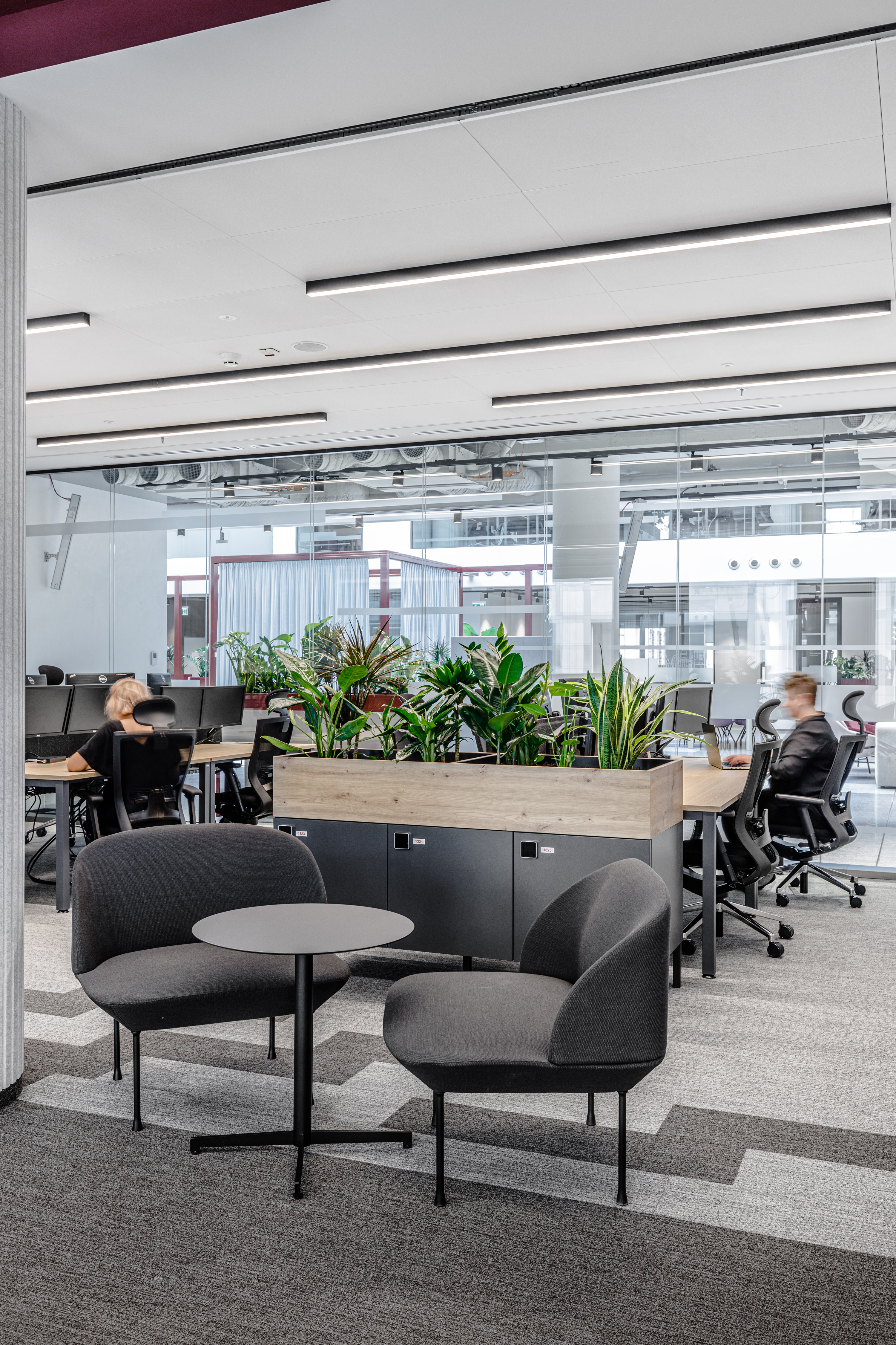
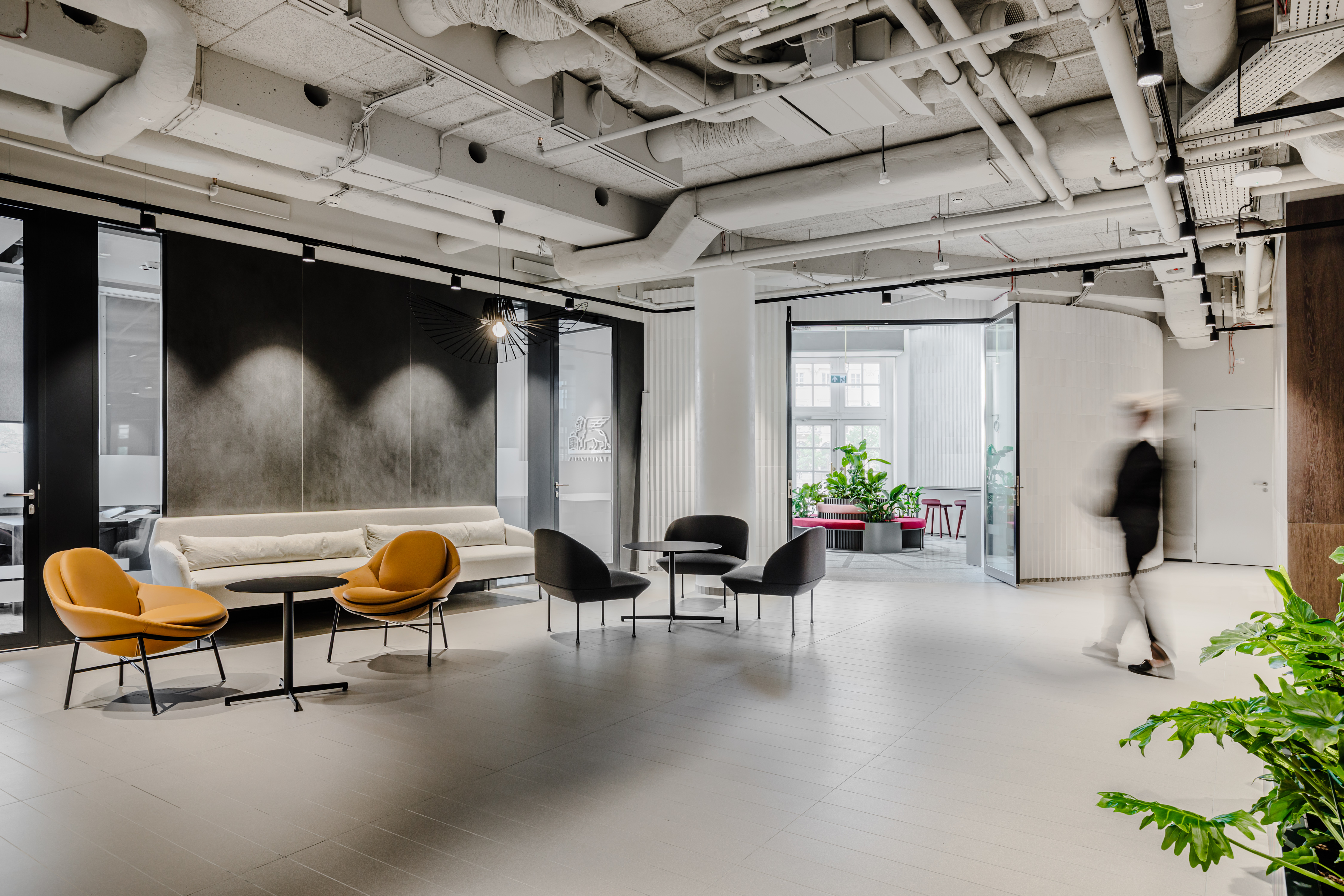
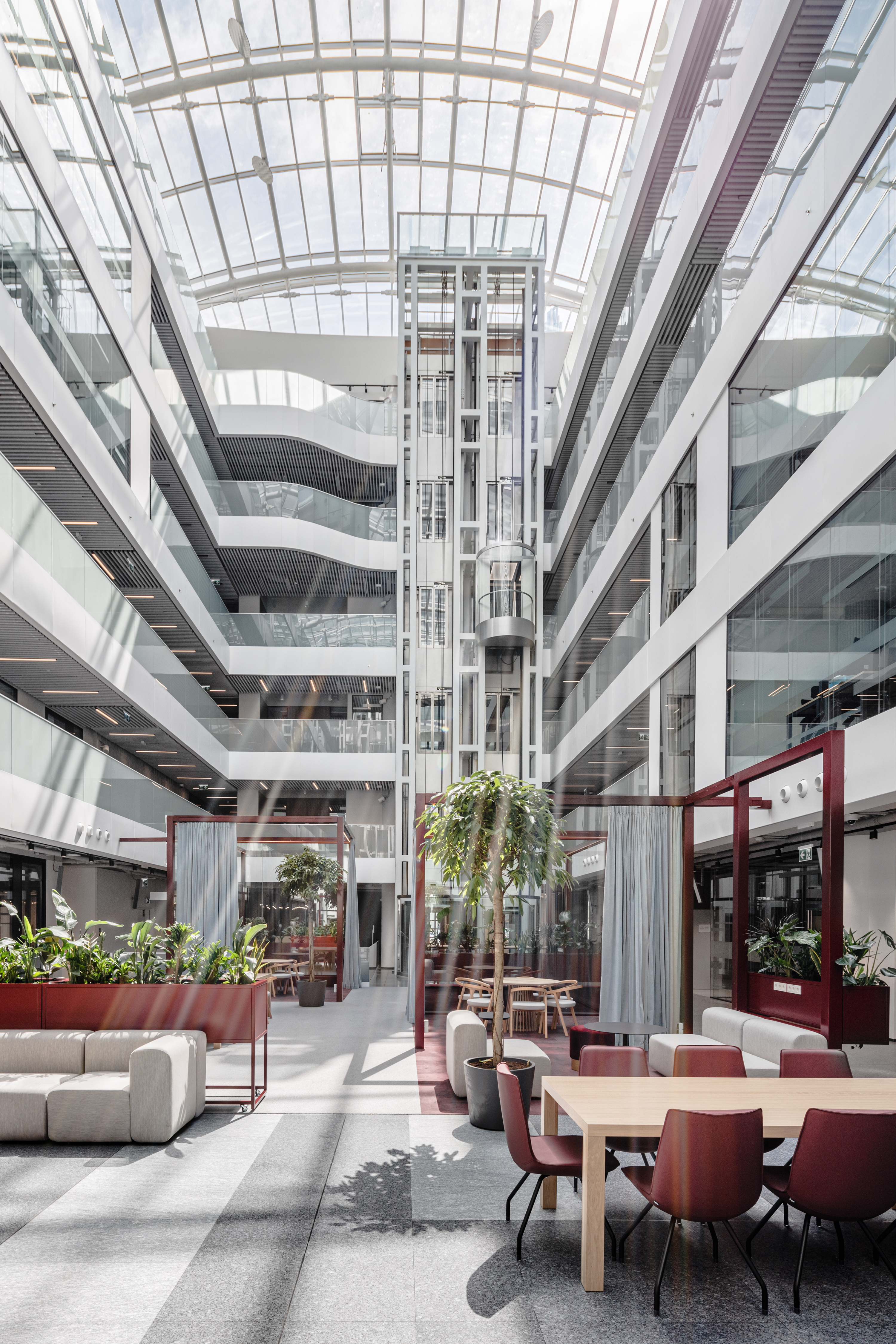
07.09.2022 / The Warsaw headquarters of an international insurance provider has changed from a chaotic, cold space to an arranged, welcoming interior. The office, although quite spacious, supports relationships and collaboration. After three years of project works and pandemic restrictions, life returns to the renovated object. Its new tenant is Generali. The commodious space has been divided into areas fit for various purposes and the re-fitted atrium draws on the best that the Italian Renaissance has to offer.
Below is a 3 minute youtube video (with english subtitle translation) summarizing the project and implementation
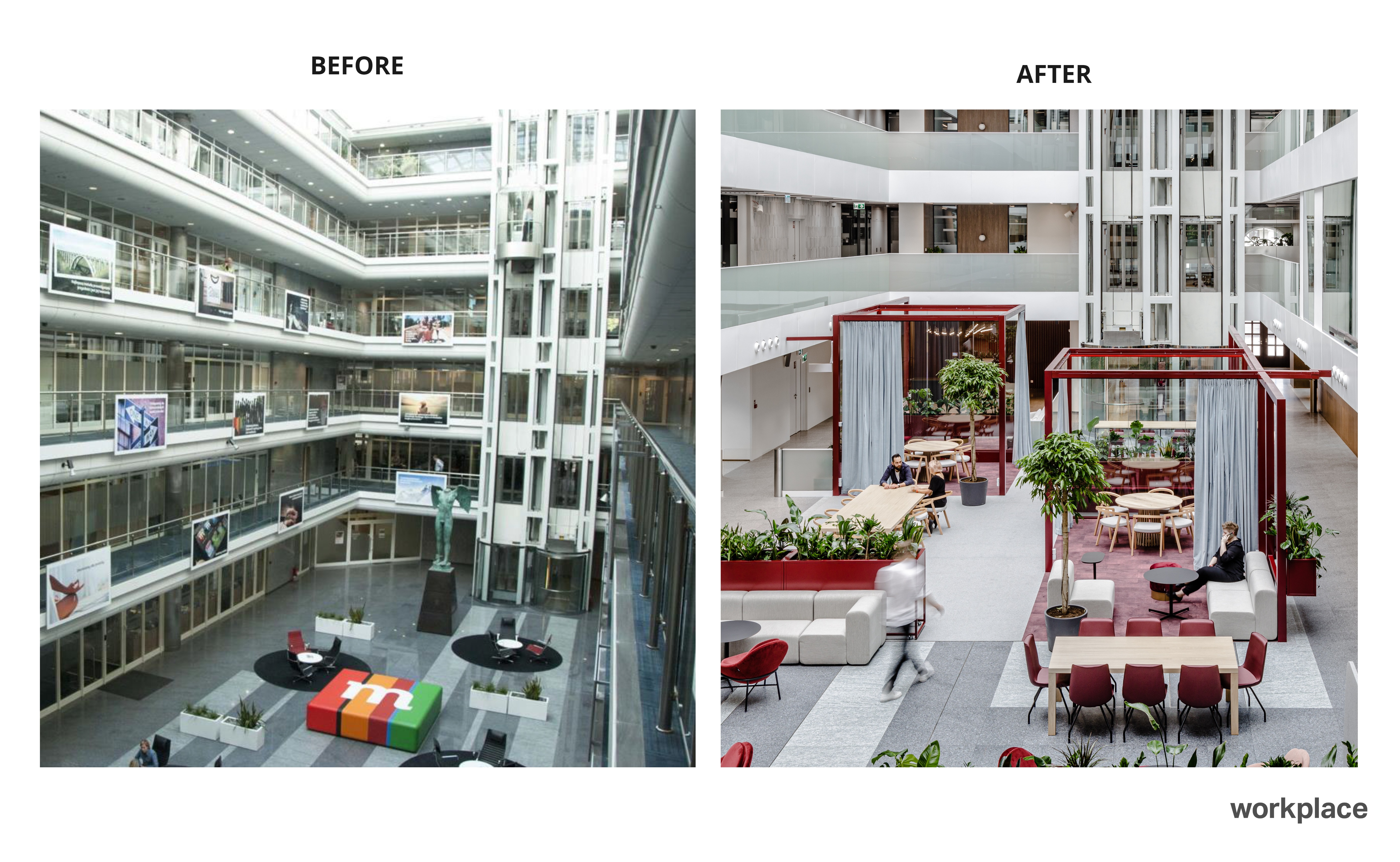
When the Italian insurer hired Workplace to revitalize its headquarters in a historic building on Senatorska Street, the focus was on restoring the internal lobby. As years have passed, the space has lost its aesthetic coherence and its cool and unwelcoming fitout did not encourage employees to spend time there.
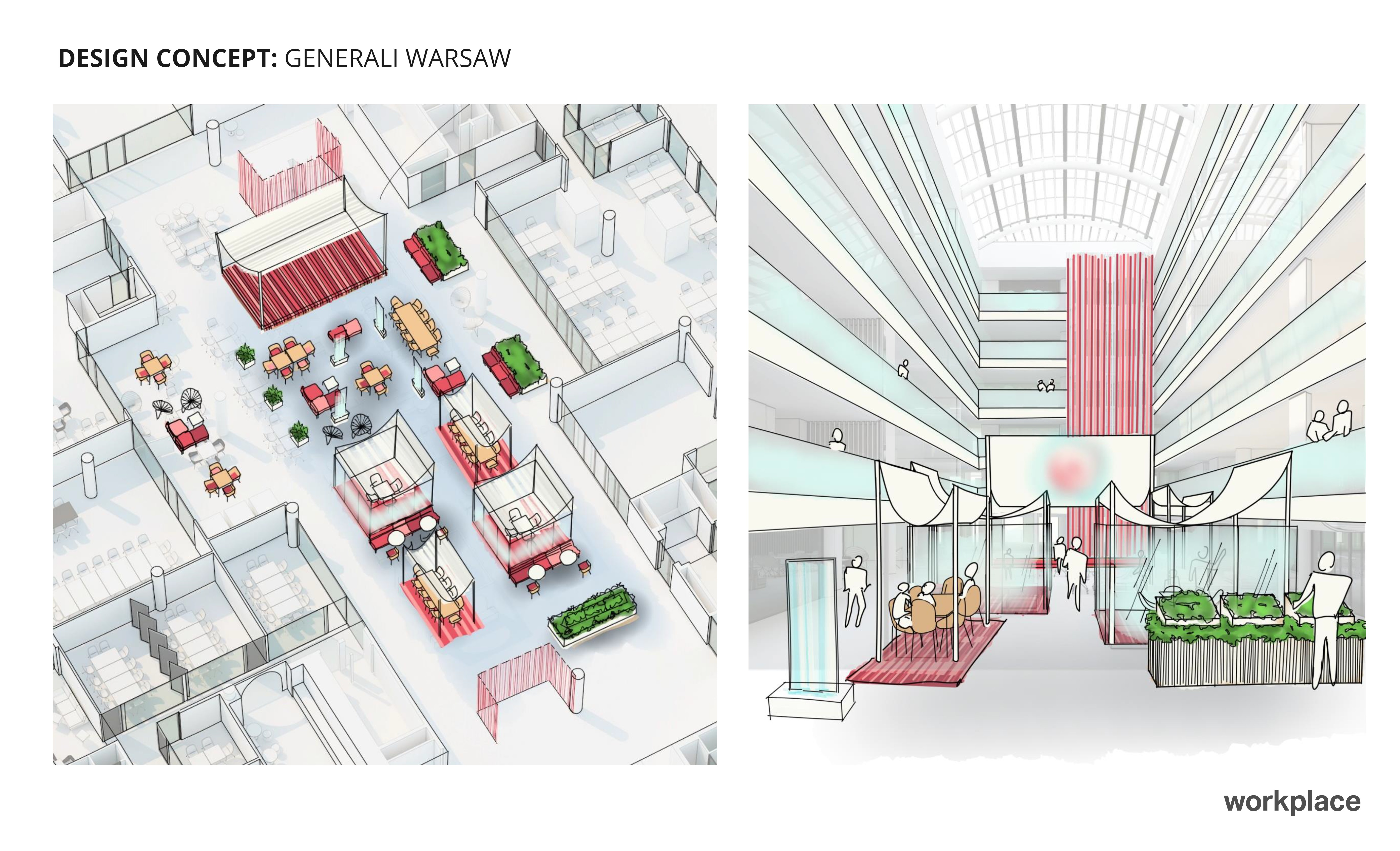
The journey from “appealing” to “doable”
The revitalization of the Generali office was a large-scale project. It covered as much as 13 500 sqm. (145 300 sq ft), roughly the size of St. Mark’s Square in Venice! In addition to the design concept, the Workplace team was responsible for preparing the tender documentation for the contractor. Five of our team members were permanently involved in the project, and three additional supported them as needed.
The pandemic further increased the level of complications as the team on the client side has changed in the course of the project. In response to the evolving concept of the office, we had to modify and optimize the design and coordinate the changes with the fit-out contractor.
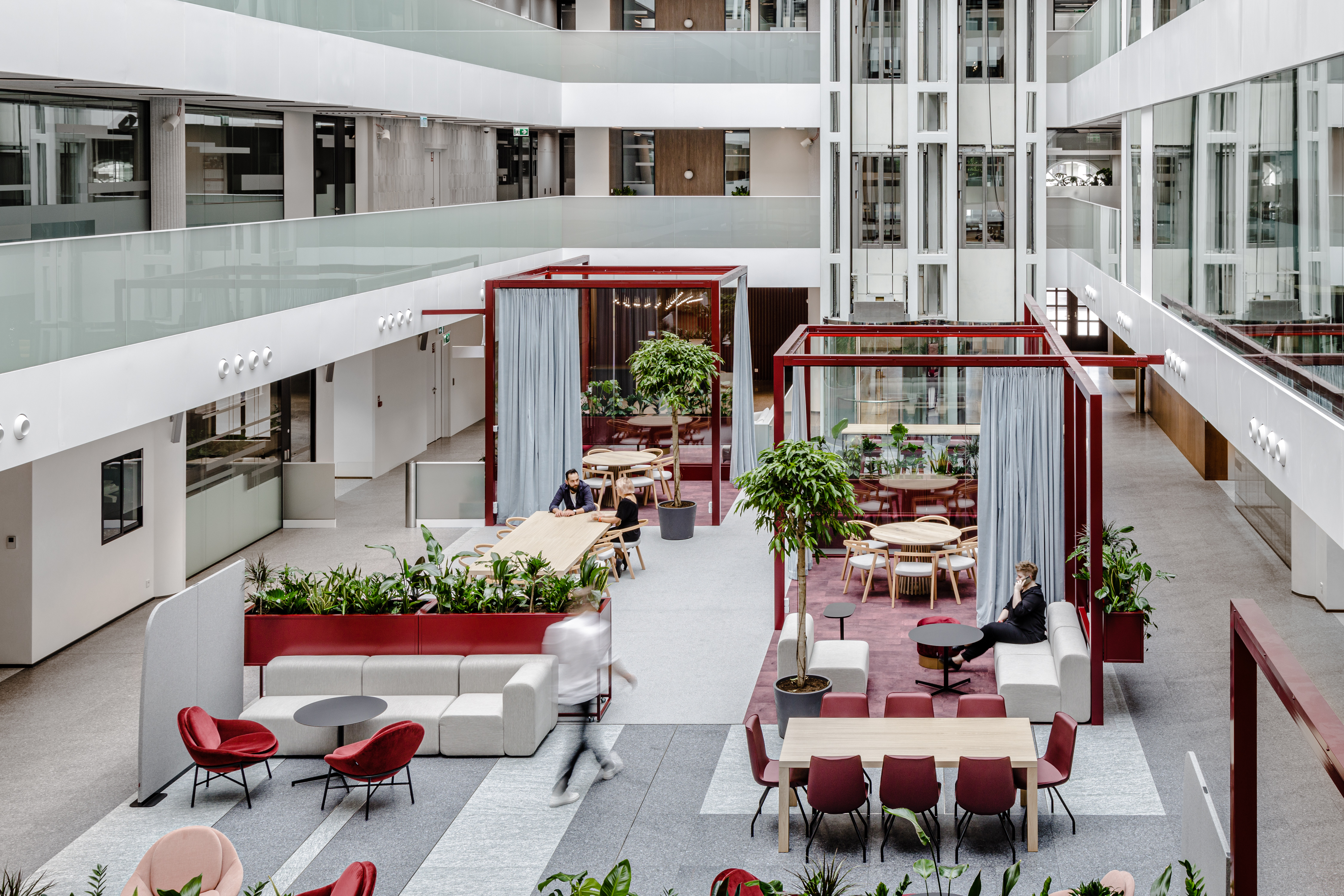
Turning a plain atrium into a Renaissance agora
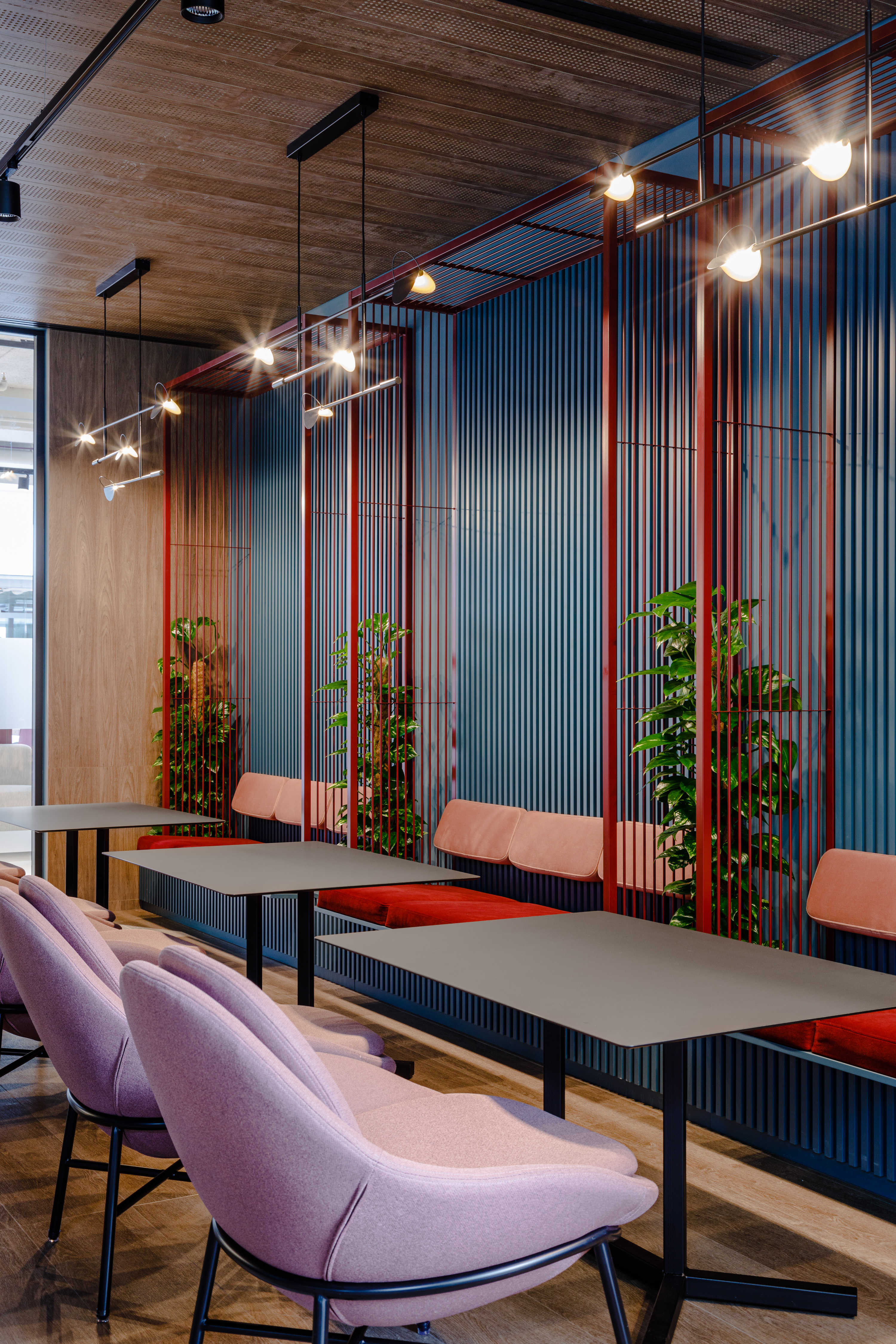
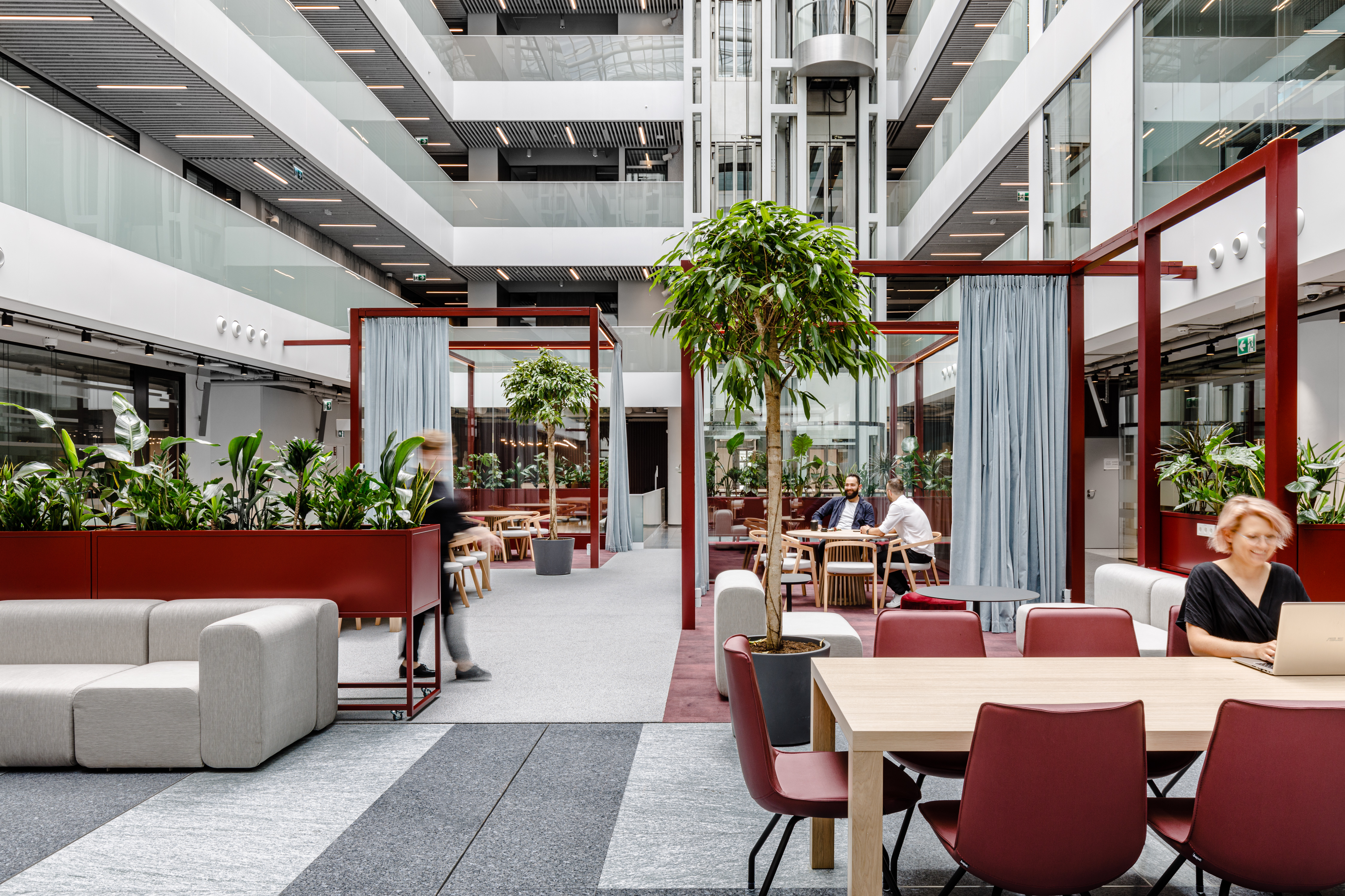
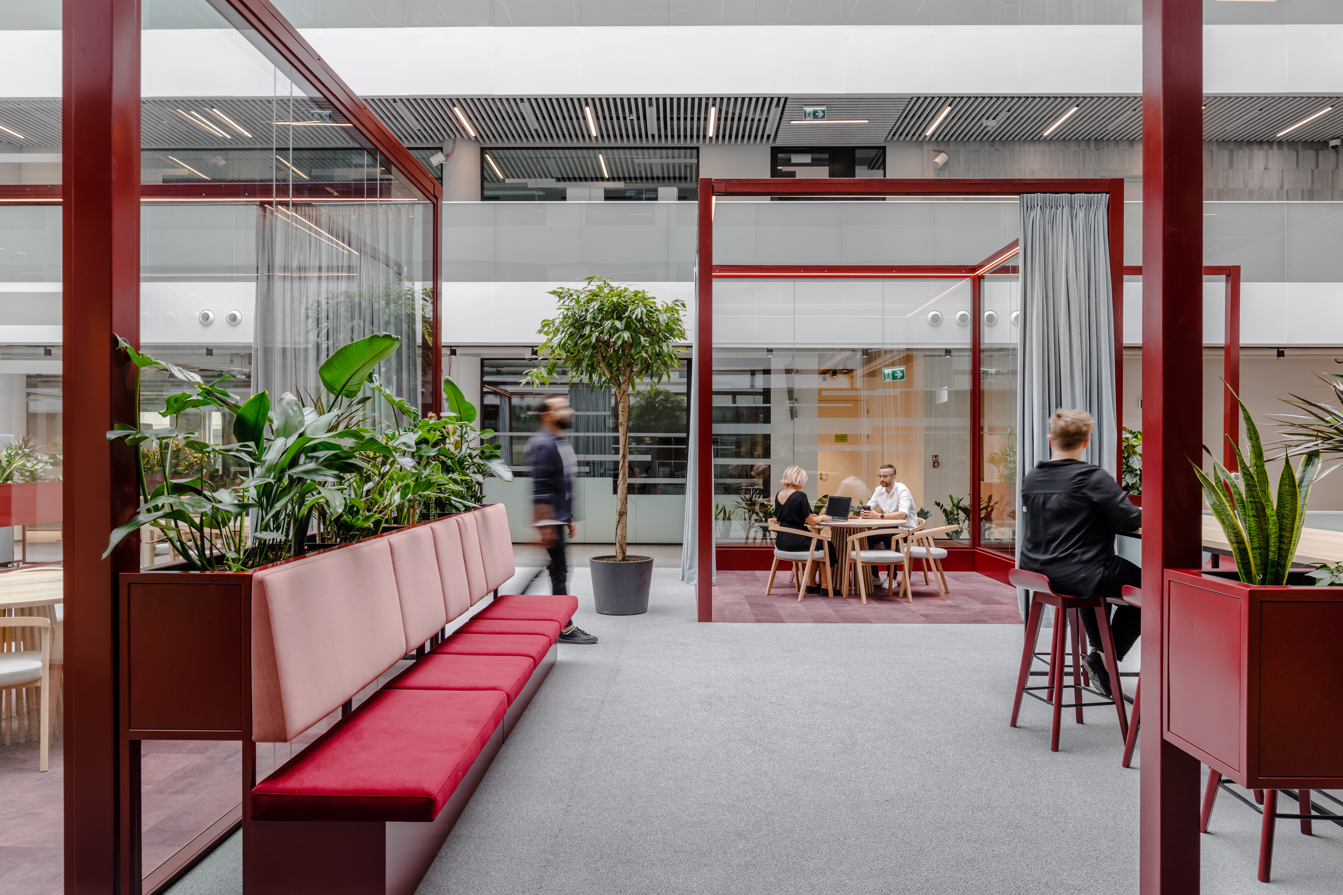
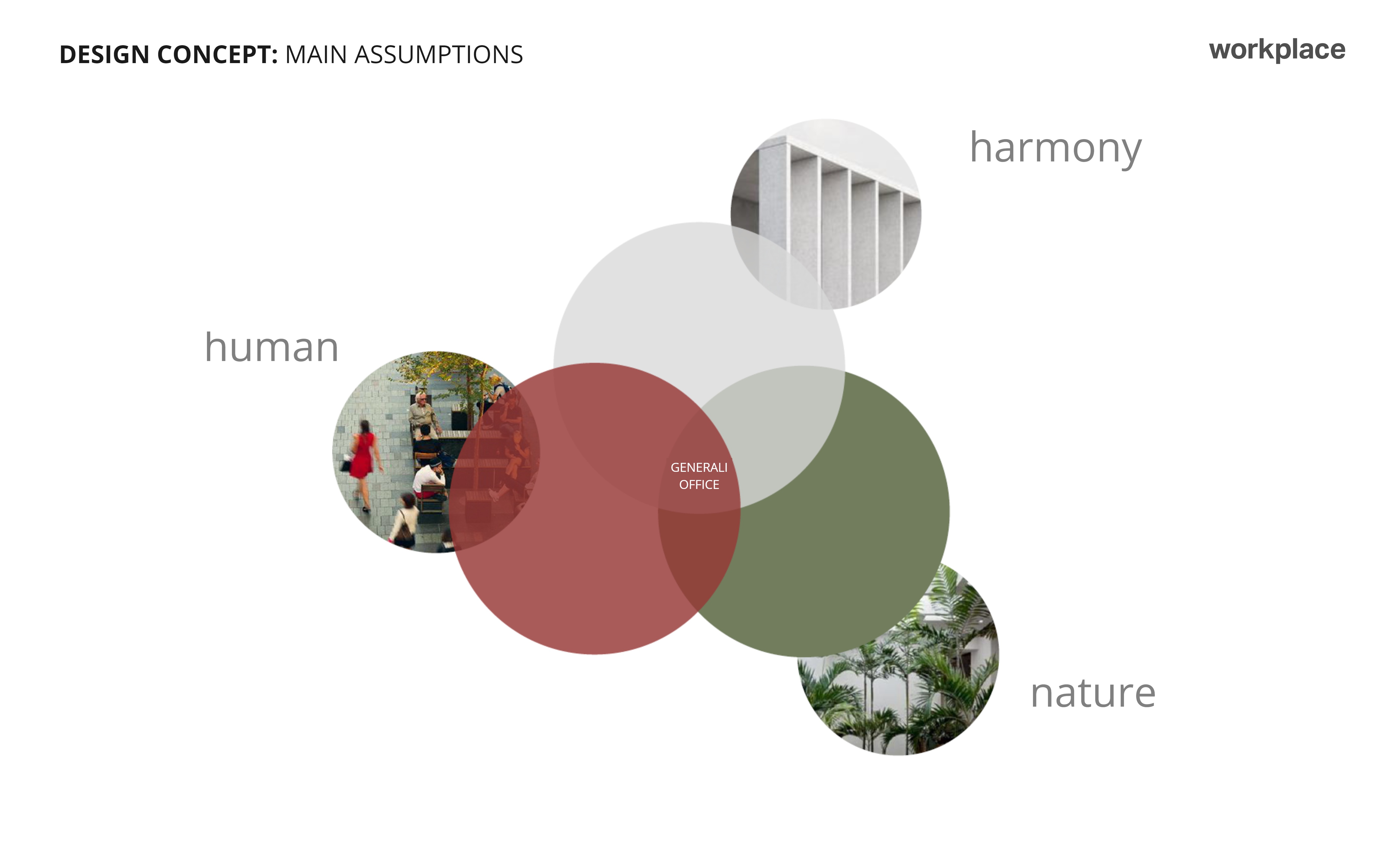
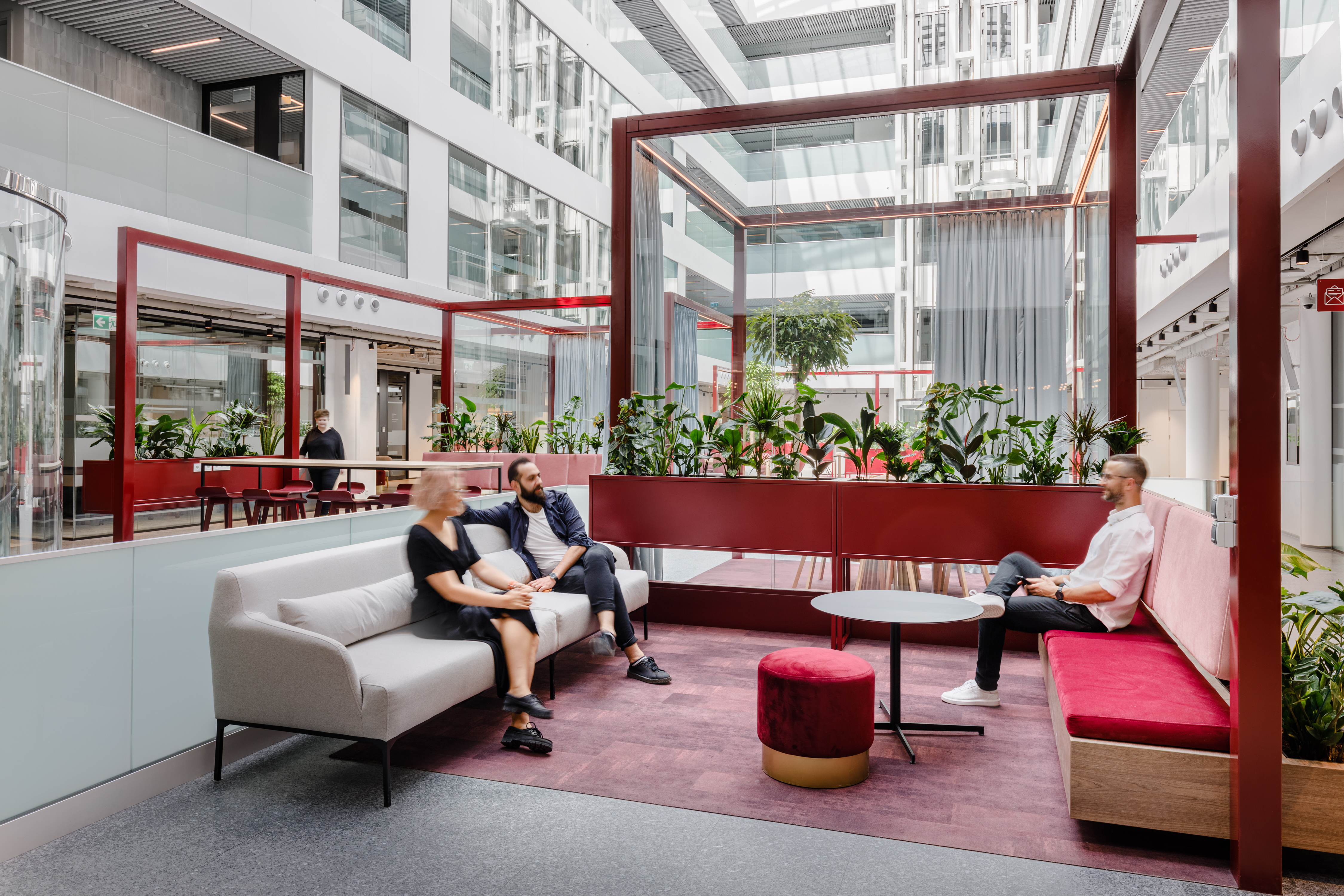
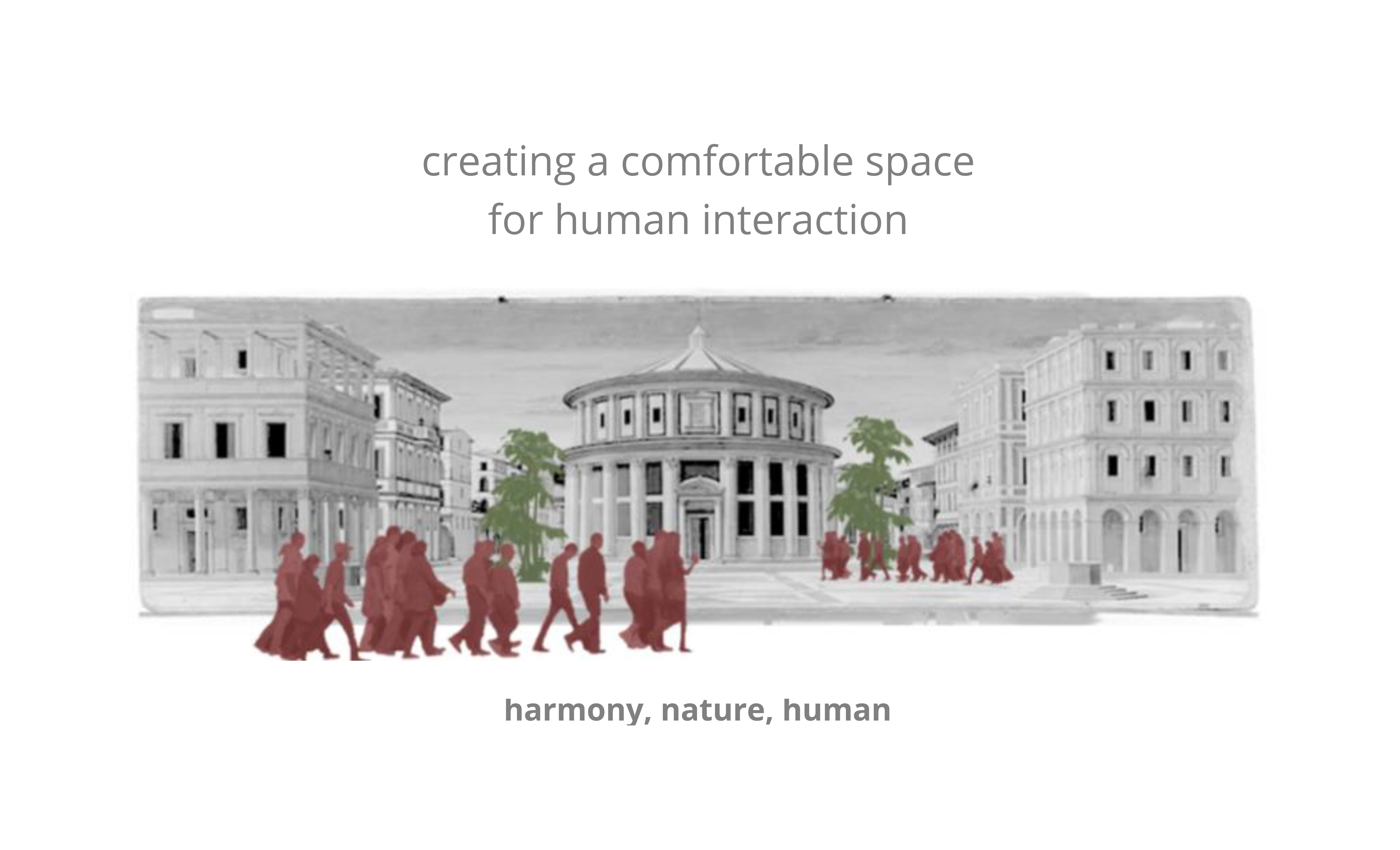
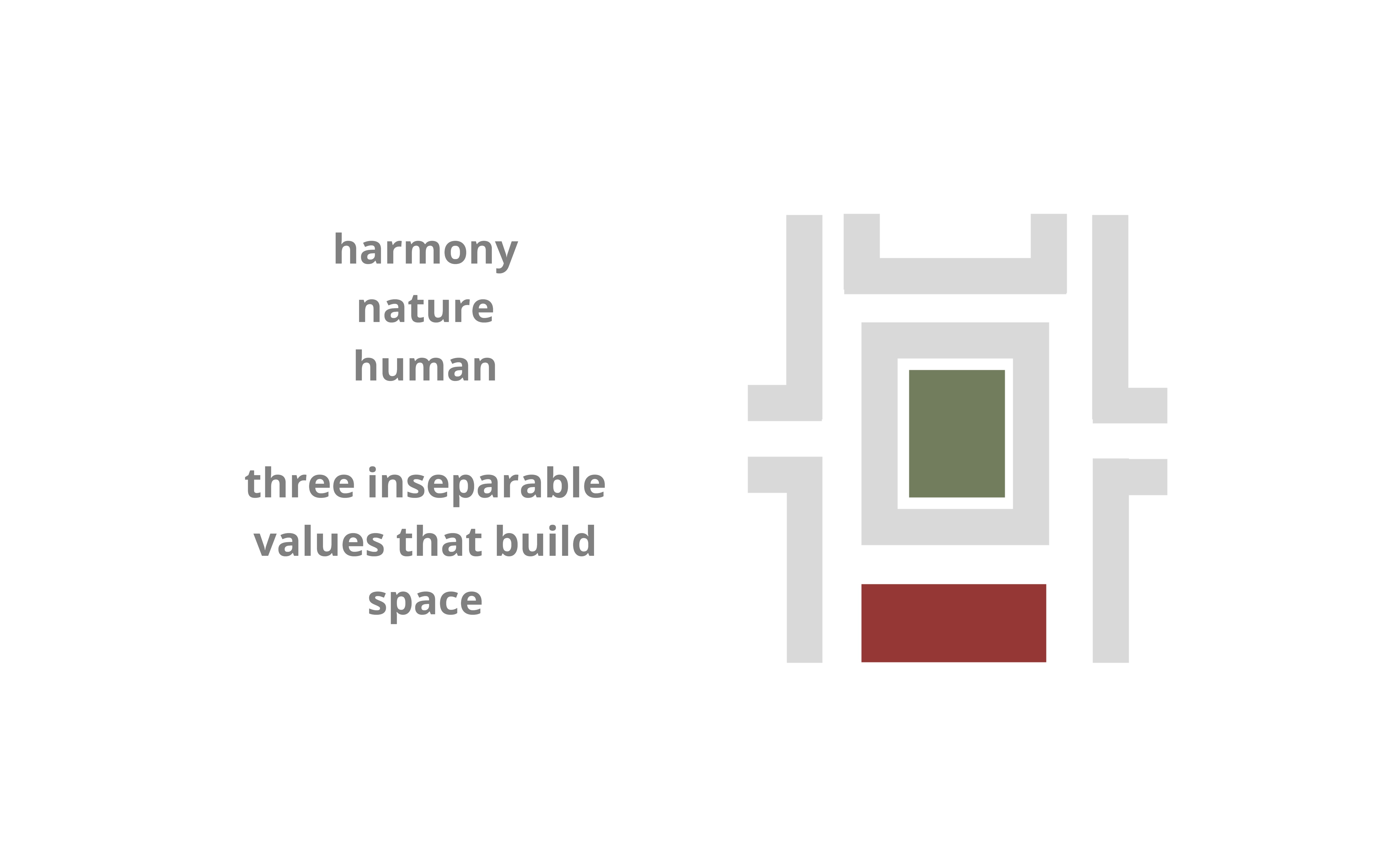
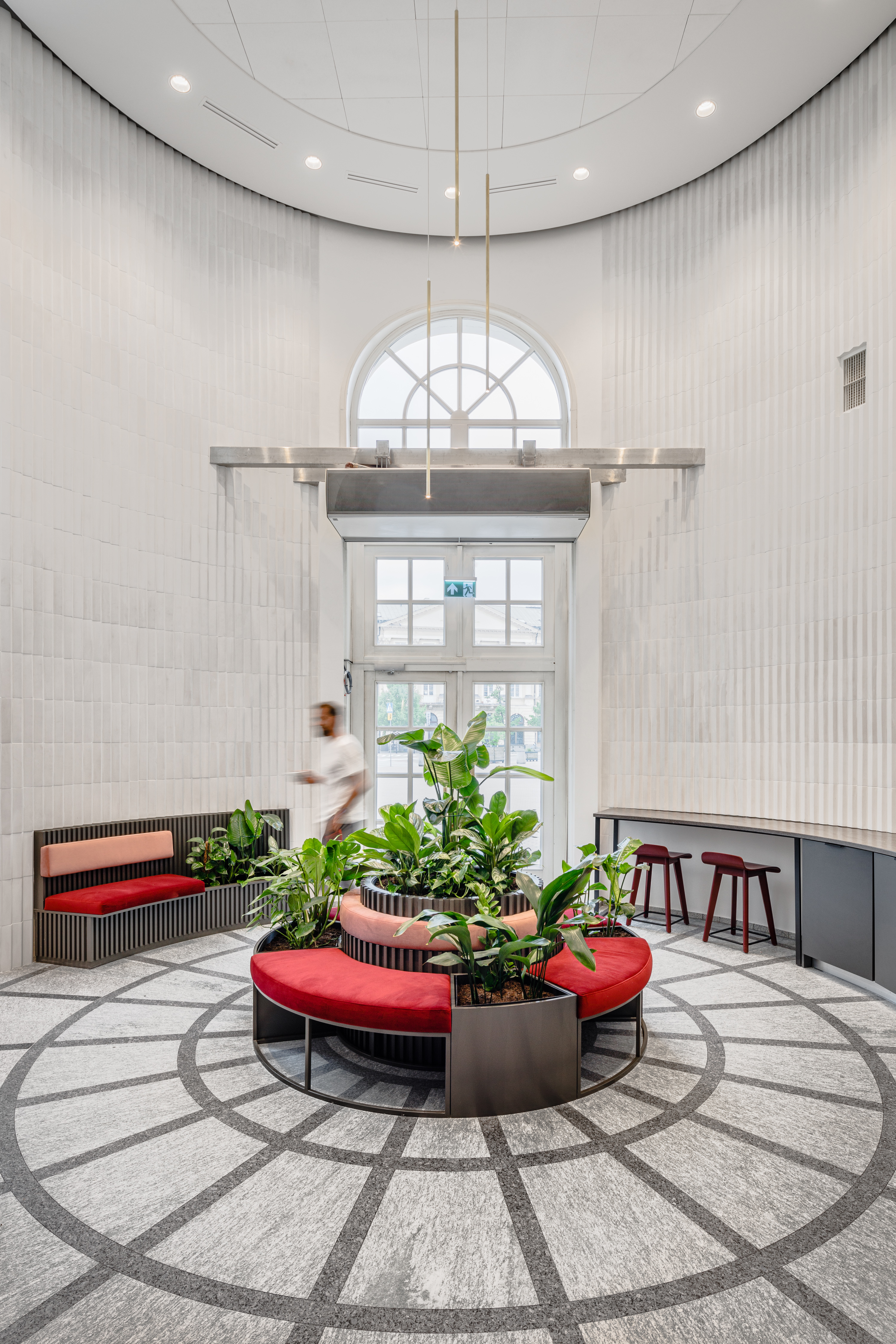
The theme of the Warsaw office of the Italian insurer is modeled after the Renaissance city. We focused on combining the legacy of this era: harmony and proportion, nature, and man. It is especially visible in the atrium, which has become a showcase of Generali’s headquarters as a place for meetings, collaboration, and creative work.
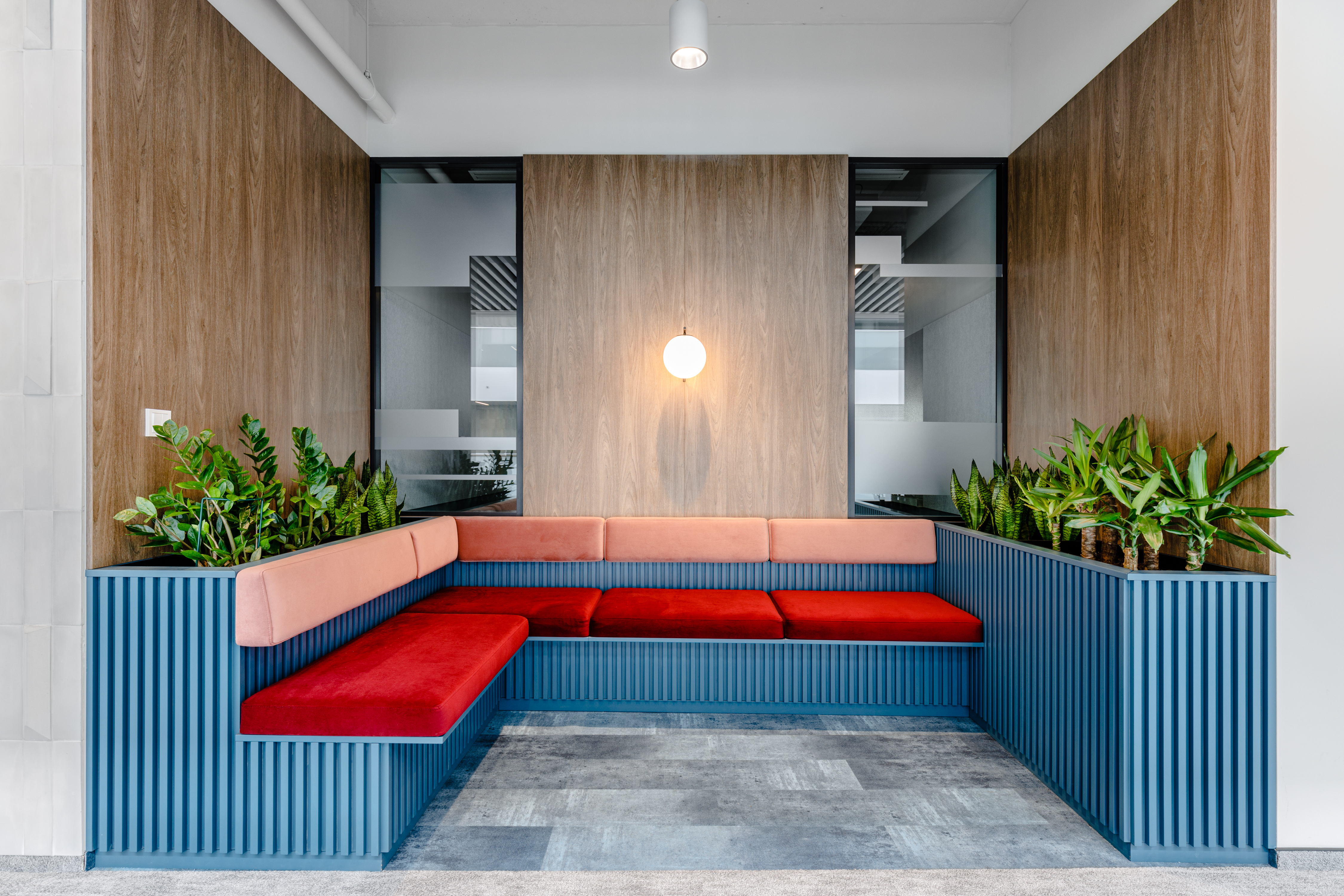
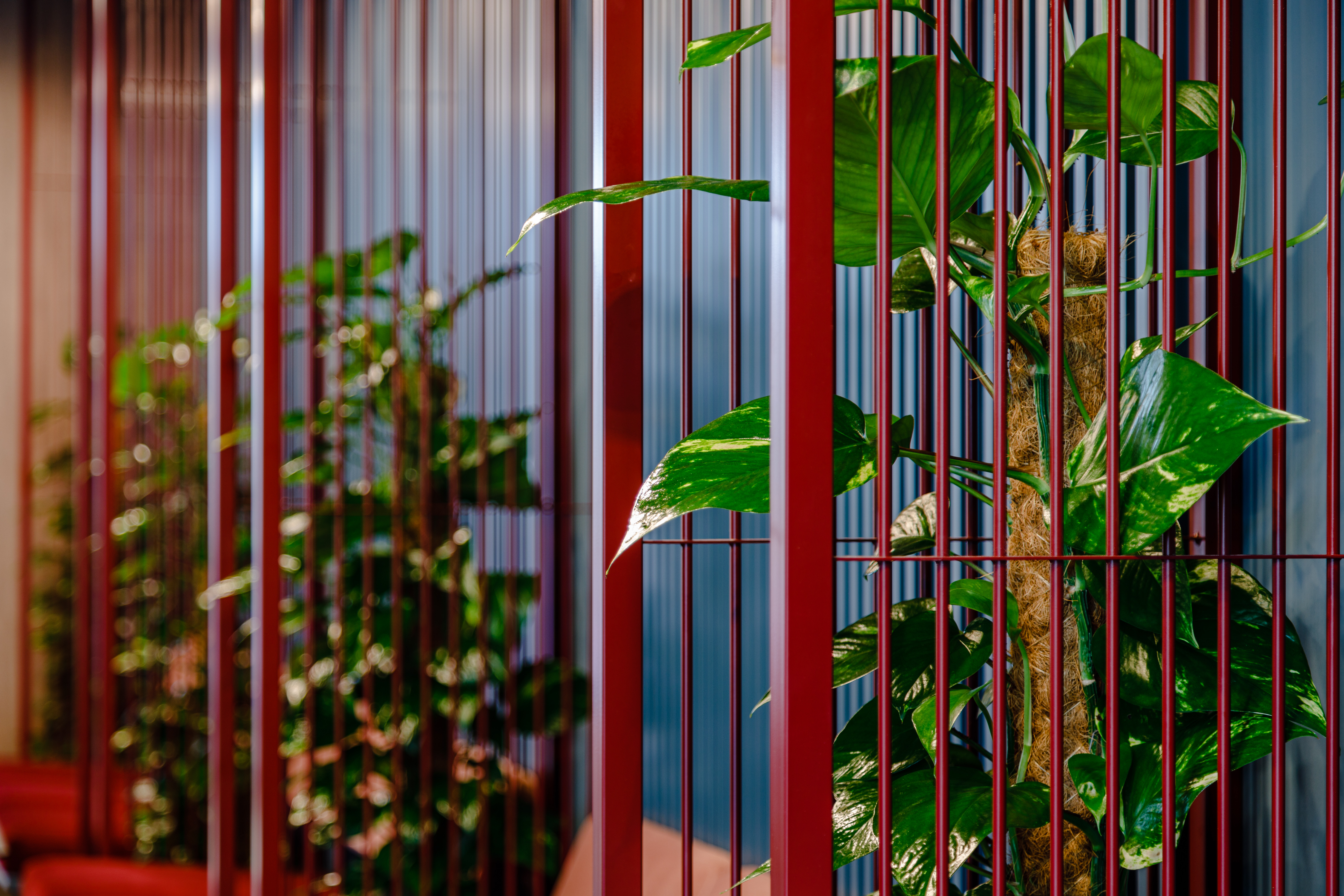
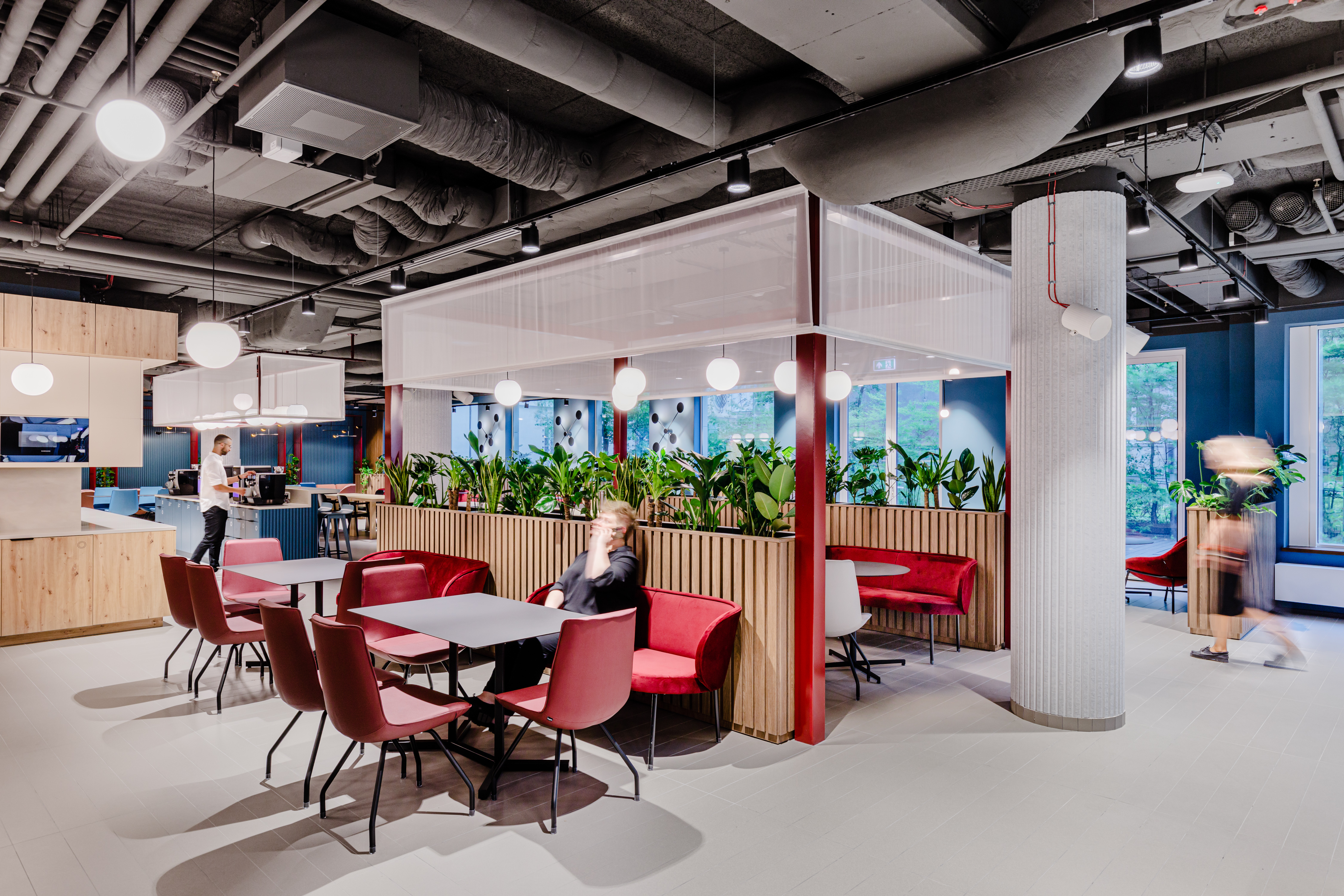
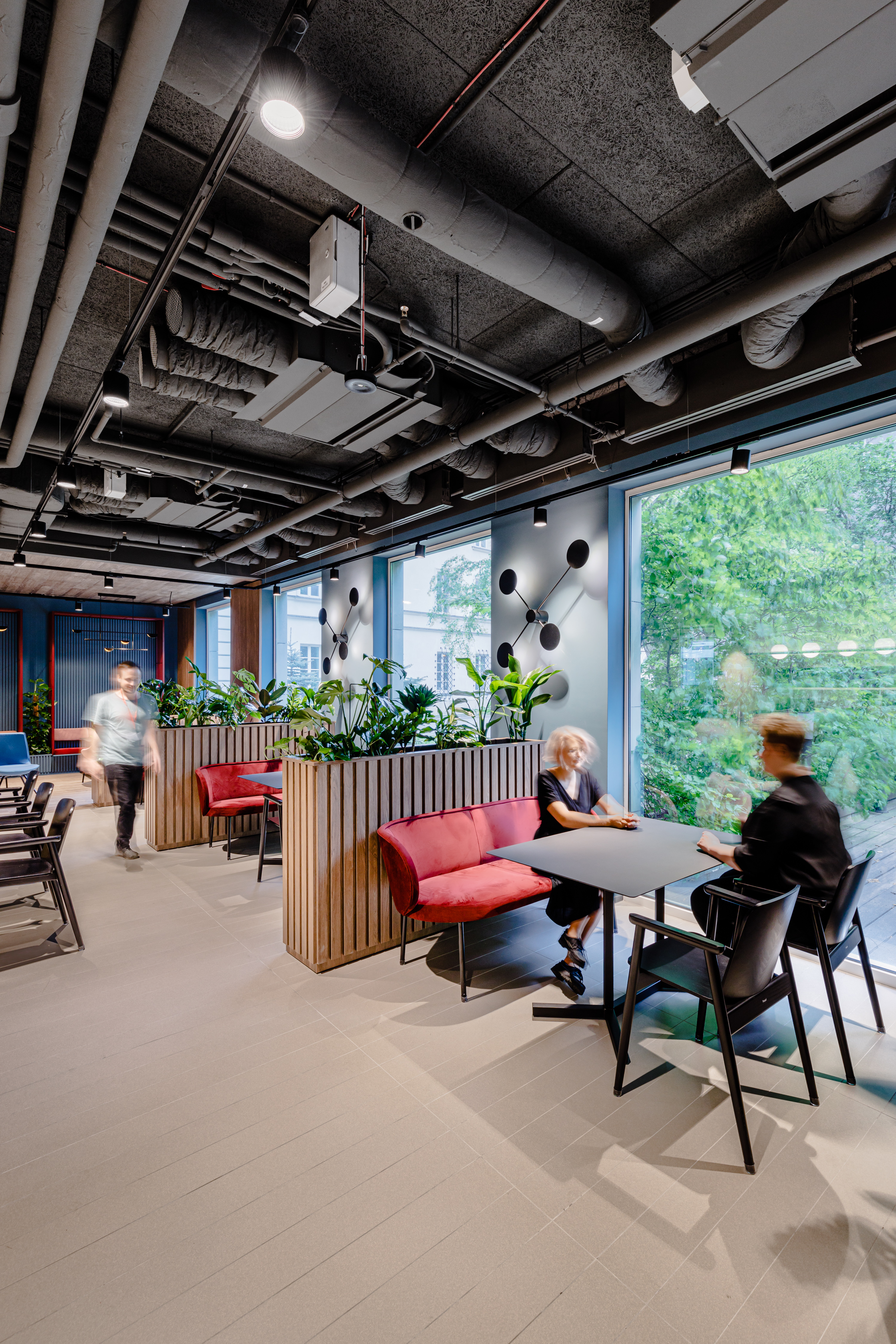
The introduction of warm and colorful materials and greenery had a soothing effect on the space. We replaced the chrome profile balustrade with toned milk glass.
Focus on the humanistic office of the future
According to the study “State of Hybrid Work 2022: Europe”, a workplace that is unable to adapt to the new times can discourage employees looking for an employer to bond with. As shown by a study conducted by McKinsey & Company, younger employees (aged 18-29) are especially interested in hybrid work as they count on mentoring and opportunities for new contacts.
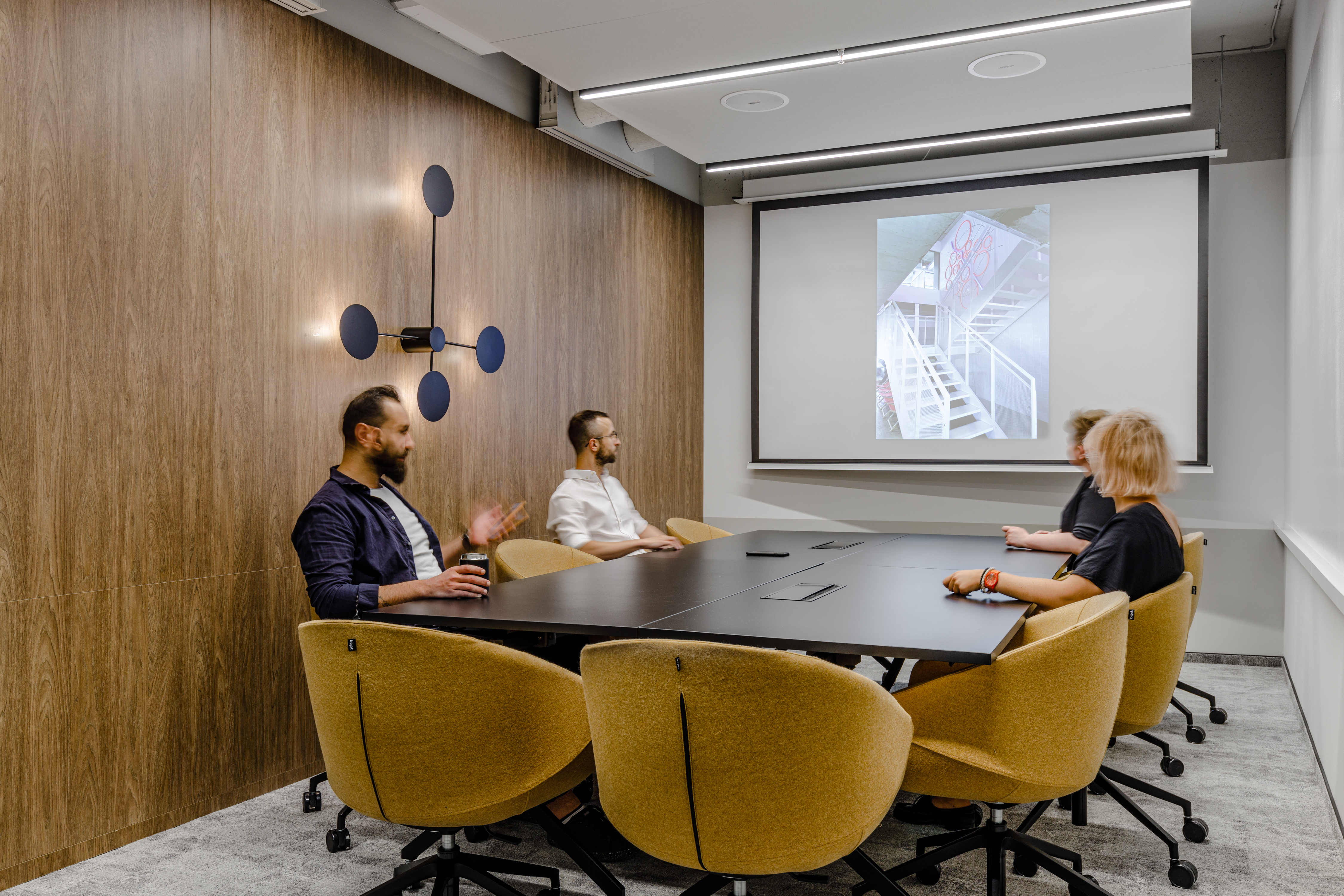
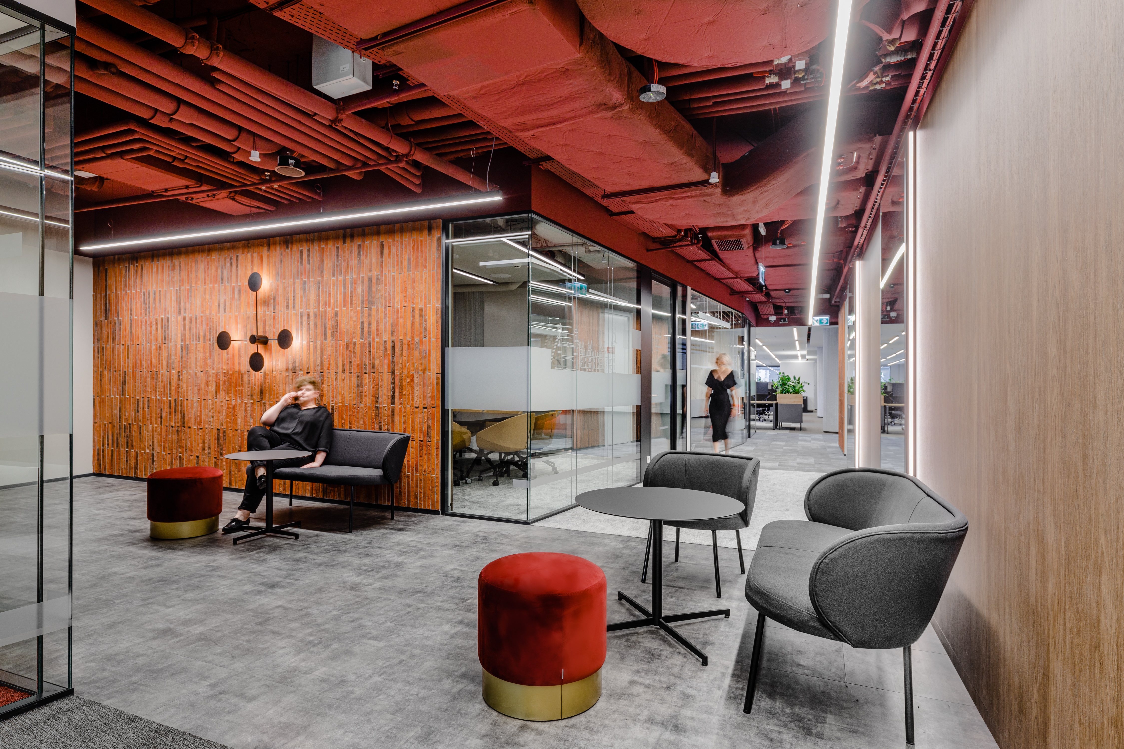
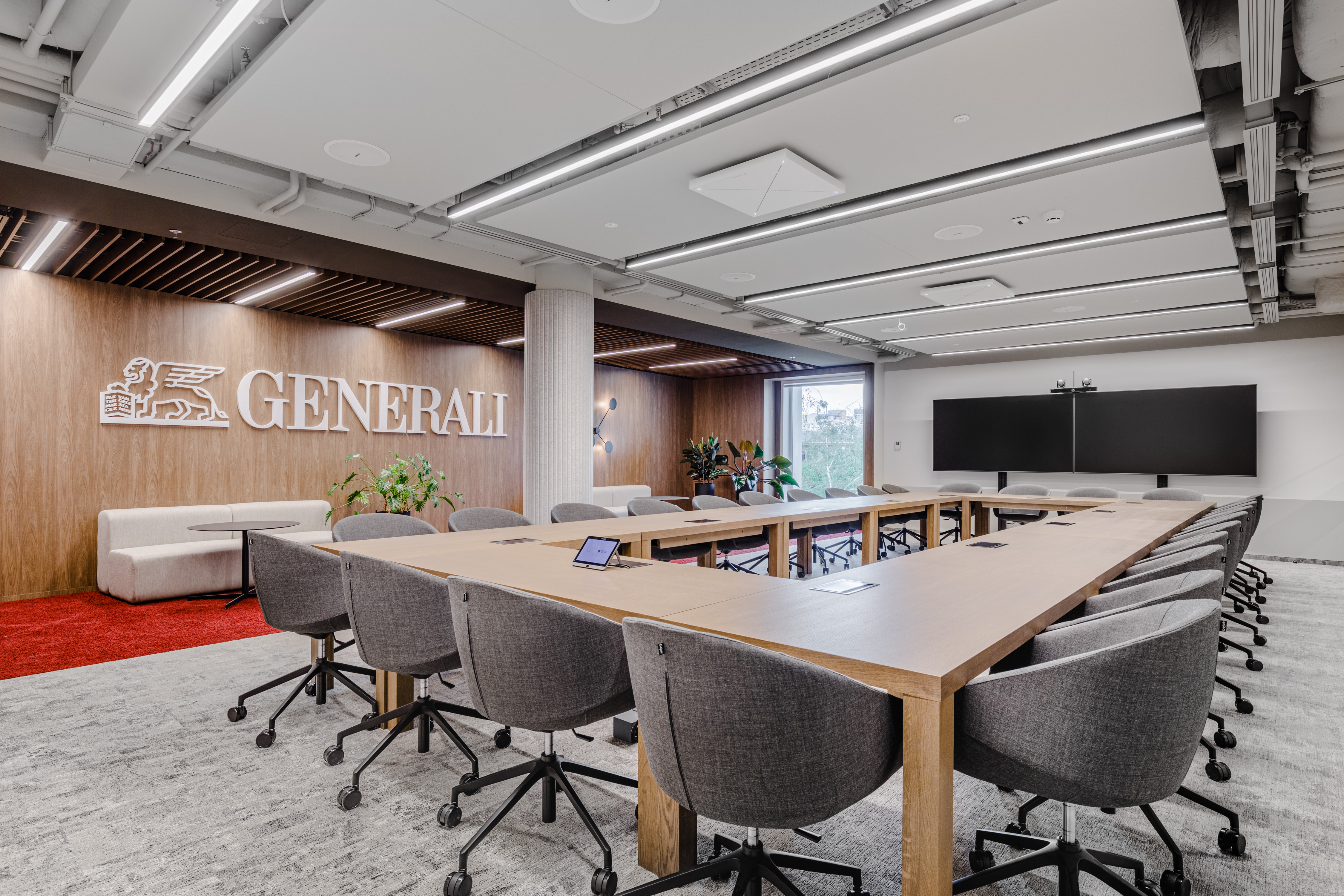
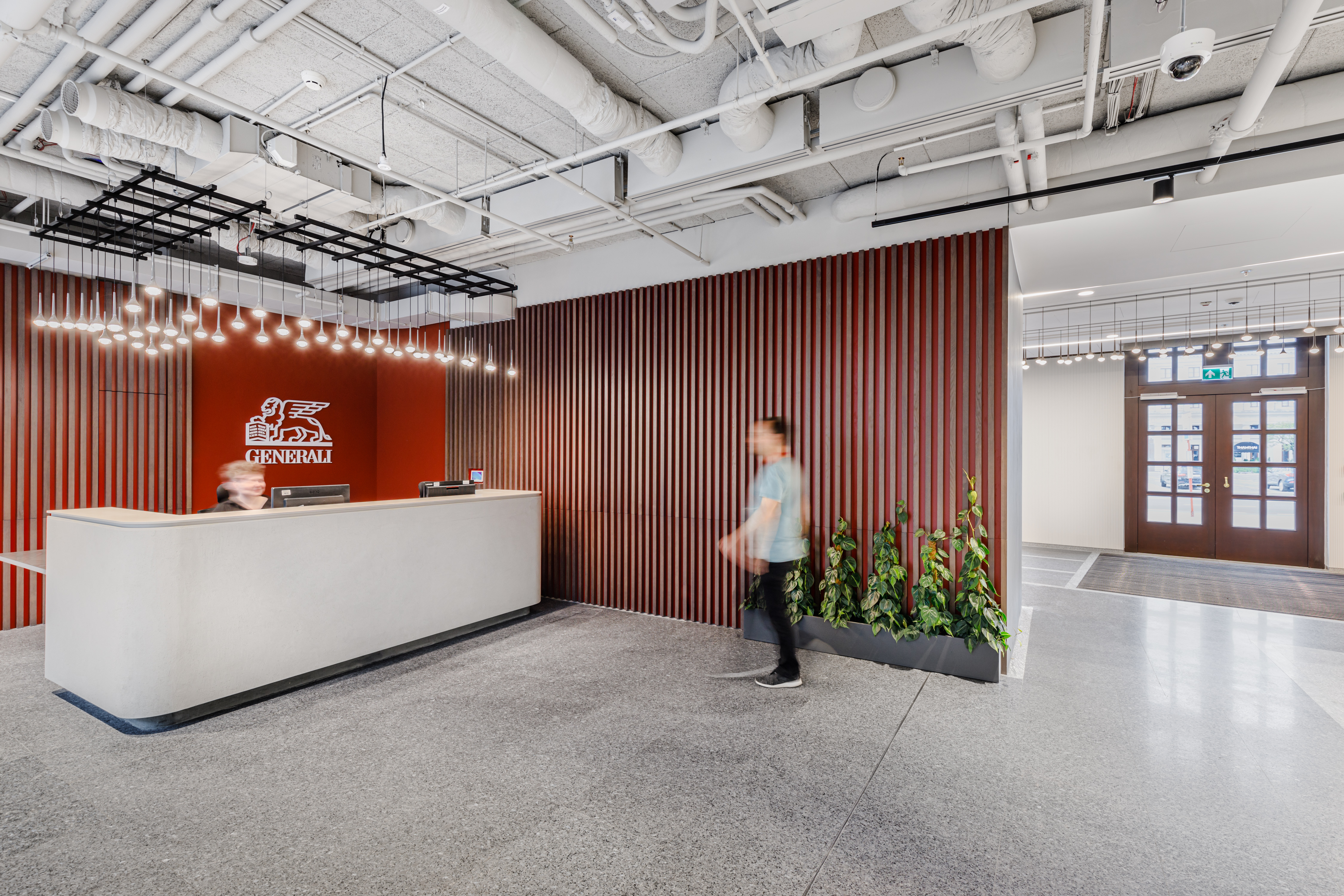
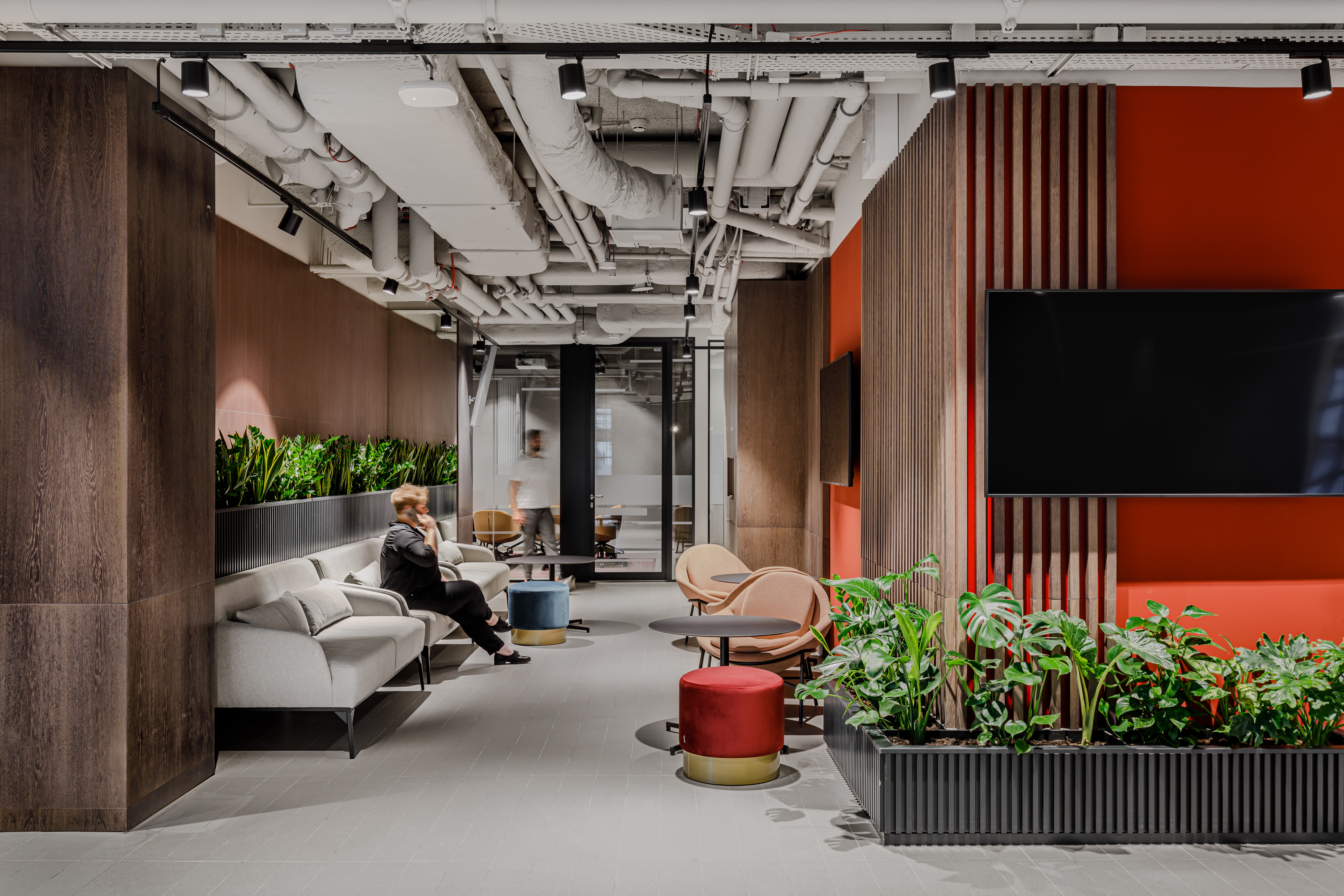
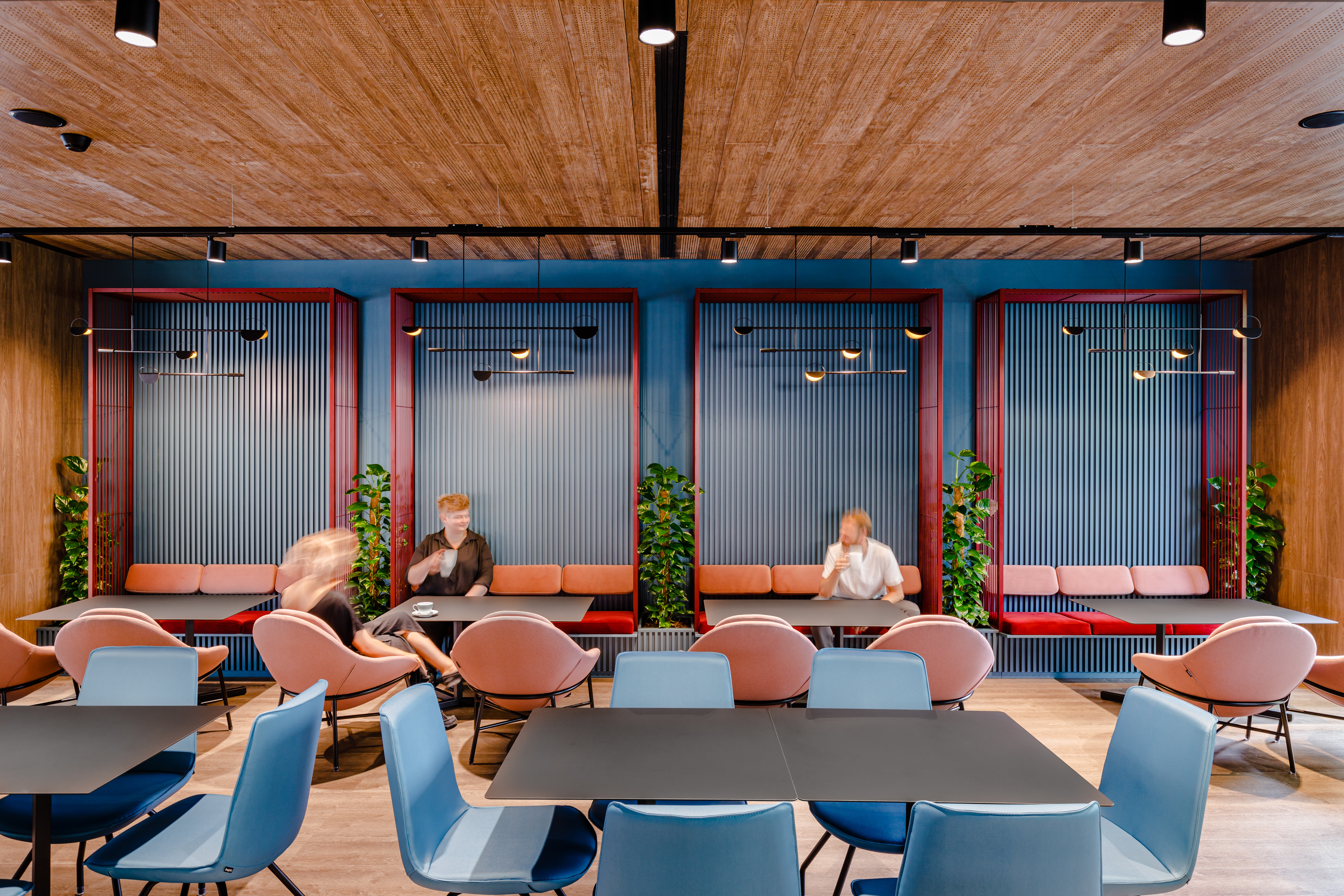
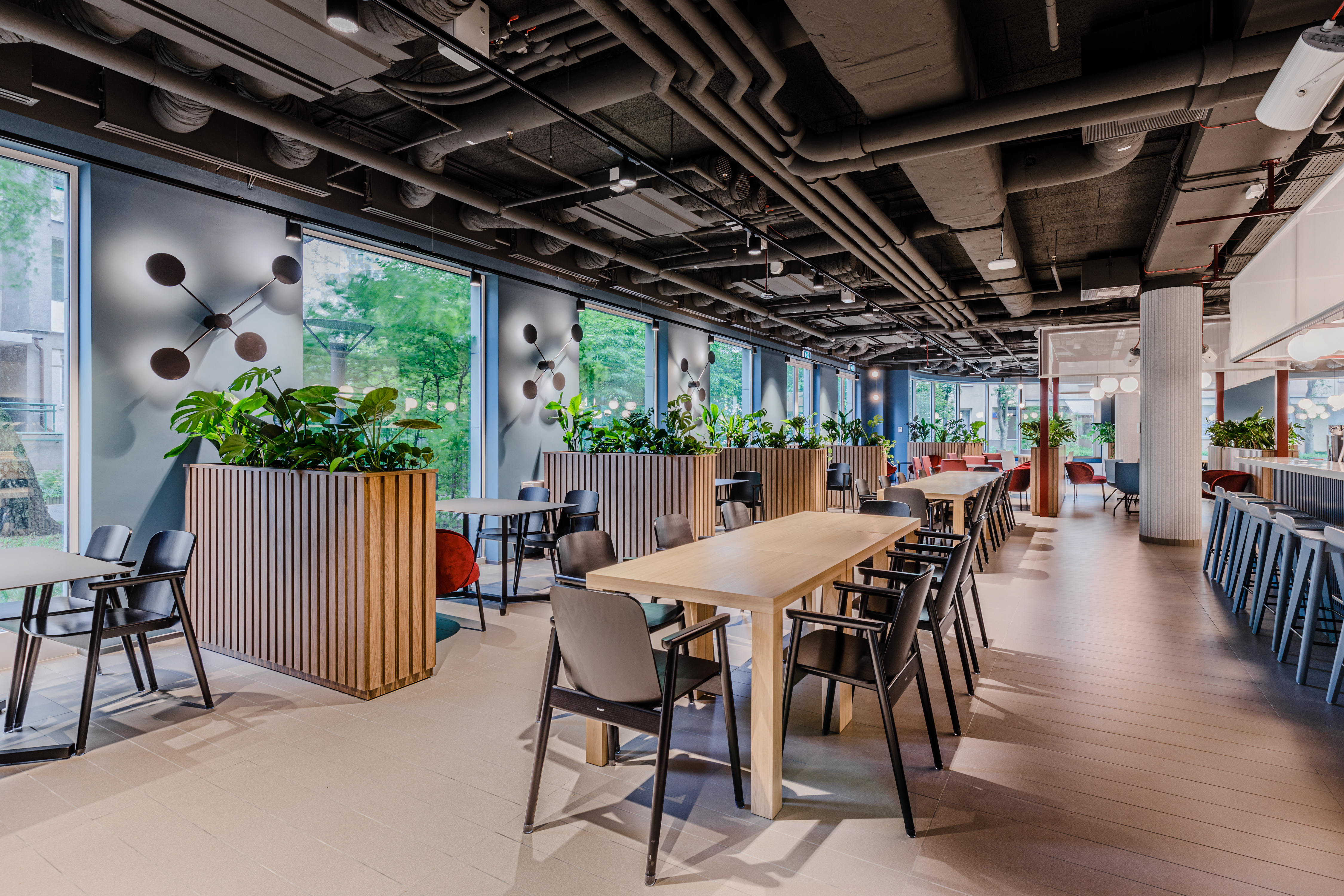
When considering the optimal combination of Generali’s corporate guidelines with our concept, we tried to focus on the role that this space is to play in the coming years. Most of all, it is to encourage employees to work on-site. Guided by the concept of bright and spacious places that support wellbeing, we have introduced a harmonious, neutral design in warm colors, also in spaces for focused work. The result of anthropocentric, neo-Renaissance thinking is also a higher standard of the workplace: ergonomic office equipment, better lighting, as well as a broad selection of informal meeting areas.
Credits
Board: Dominika Zielińska, Bogusz Parzyszek
Lead architects: Aleksandra Czarnecka, Katarzyna Gajewska-Kulma, Rafał Mikulski
Design team: Aleksandra Piotrkowicz, Sylwia Rebelo, Weronika Pariaszewska, Barbara Majerska
Design support: Ewa Jędras, Urszula Dziedzic, Maciej Kolak, Michał Pyka, Maria Shapoval, Katarzyna Brzostek
Visualisations: Paweł Deroń
Photos: Adam Grzesik
Tekst: Marta Smyrska, Grażyna Zawada
About the project
Area: ~ 13 500 sqm (7 storeys)
Location: ul. Senatorska 18, Warszawa
Project duration: 18 months (design process), 32 months for customer move in
